

NSFW LOVECRAFT ILLUSTRATION
When we last left our hero, he was working on illustrations for the Monsterwax Lovecraft trading card set.
Among the ideas I originally sent over was this one.

A million years ago I was a manager of a thrift store in a ghetto. It was an interesting job and since hardly anyone there bought or stole books, I had my pick of the litter as far as that goes. A lot of old books on illustrating would come in. These were from the 50’s 60’s and written by guys who were still alive when the era of pulp magazines was big, so I paid attention.
One was about drawing horror stuff and monsters by some pulp magazine guy. He talked about the elements that are horrific on a visceral level. Stuff that is instinctually unnerving and creepy as opposed to a shock scare or gore. He said a monster, in this regard, has one of three elements.
1-something missing ( a person with no mouth)
2-something where it shouldn’t be ( a mouth on his neck )
3-too many of something ( two mouths)
he went into the psychology of why, but I don’t recall the specifics, and i don’t know what happened to the book. The rent-a-cop at the store was a raging alcoholic and there was an…”incident” while I was reading and by the time it was over the book had gotten shuffled back into the pile. I didn’t have time to dig it back out ( cops are always so impatient. Like…give me a minute, I’m not telling you anything anyway. There’s 12 gang members in here a day…you think I’m gonna risk my life to rat out one of them? No thanks. Plus, they spend a lot of money here and I get bonuses)
Anyways…Of the three illustration ideas I showed you, this one is hands down the creepiest, and it’s because it has the second element I mentioned. -something where it shouldn’t be-
Which would be the vagina. It “shouldn’t be there” in the spirit of the law, not the letter of the law. Obviously the vagina is in the correct spot for a humanoid, but in the style I draw and in a fantastical scene like this…you wouldn’t expect to see a vagina. and it’s not there in any sort of sexy way, appealing to prurient interest. It just there matter of factly. It’s not quite threatening because it’s a vagina…or is it? If this was a scary merman and he was lurking towards you with his penis showing, that’s be fairly threatening on an instinctual level. The vagina here is more of a jolt making it clear that this creature is to be taken seriously. It’s cartoony, in a cartoony world, but it is also jarringly real in it’s sexual aspects.
I don’t do nudity/pin up stuff as a general rule, because I don’t believe in objectifying women.
bwahahahahahaaaa ahahahhaahaa
hahaha…sigh…ah, it’s the middle of the week, we all needed a good laugh.
Seriously though, it’s just not my thing. but I really like this illustration. I figured Monsterwax would give it a pass or have me remove the vag, which would be fine (shrug). I’m not one of those guys who takes it personally if something needs to be tamed down. and even if I was…it’s a mermaid vagina…there ain’t much ground to stand on for that being on a trading card.
BUT…monsterwax liked it too! Great minds think alike.
Of course the problem is, since I didn’t think this had much of a chance…the composition was half baked.
Here’s the problem…the long curved lines are creating a visual funnel, leading the eye to an area ( X ) with nothing going on.

I played around a little with the figures in the foreground, but that just made a visual mess of things.

Tried some other modifications…

I changed the cliffs in the background to funnel towards the central figure. The big curved lines are still a bit of an issue but not as much, but there is the question of how much of the curve of the hip (arrow 2) can I cover without losing the impact of the posture? and I think it’s important to be able to see at least one of her claws in full (arrow 3) . The curve of the knee (arrow 4) is something I’d like to be apparent, to help keep that posture impactful and if I keep the claw then I have to shift the arm in the foreground to the left and lose the knee. also I don’t want the vag to be the visual central focus (big red arrow…hahaha), I just want it to be noticed secondarily for the sake of creepiness. I think if there’s any implied lines leading the eye to it, it’s not as good.
Really though, do I even need the figures in the foreground at all? This is for a trading card and it’s going to be around 3×4 inches. At that size i might be trying to jam ten pounds into a five pound bag.
I inked this up without the figures, looks decent (still have to finish the water). It may actually be better without the other figures as far as creepy, since there isn’t much in the way of giving her scale. and without the foreground figures the lines on the cliff give it a cool effect.
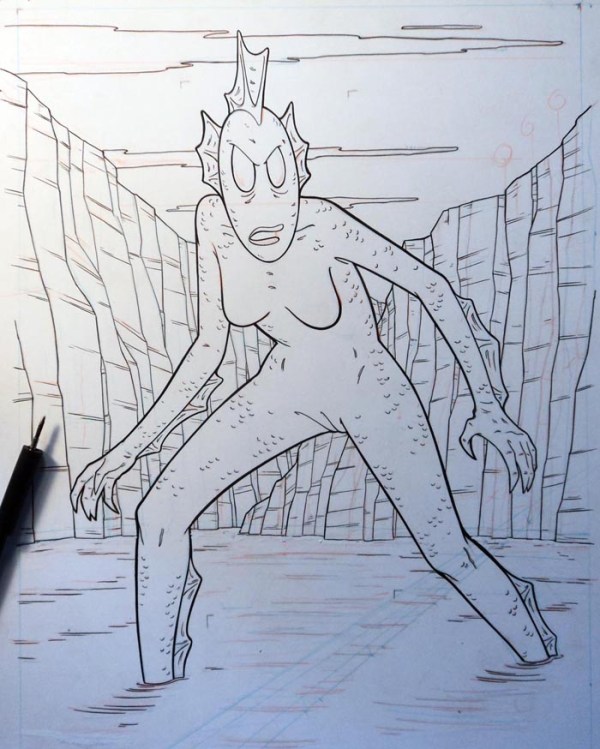
I’ll do up another with the figures, and see which one they like. This is pretty easy to ink. It’s all organic, that takes the stress out of it. If you screw up a line on a window pain, people notice. If you screw up a line on some rocks…who’s gonna know?
the Monsterwax website is here ***it doesn’t appear that this set is available for order yet*** I’ll give you the info when it is.
If this behind the scenes stuff interestes you, a while back I did a how-to video on inking with a brush, here and got a lot of requests for more. We set up a half assed patreon page here…if you’d like to see me do more how-to videos, that’s the place to chip in. That’s up to you guys, you want ’em I’ll do em, but there’s a few expenses involved, and I’m not paying to teach someone else.
OUR online store is here. discount code – voodoo- for 20% off