|
|
***If this email looks jacked up in your email window,
click on this link to see it on the website***
https://arseniclullabies.com/nl20251030shadowculled.html
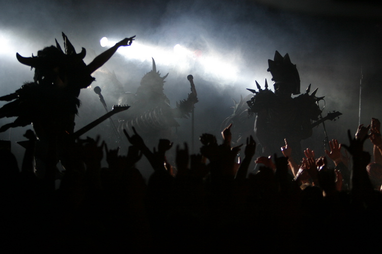
HAPPY HALLOWEEN!
THIS WEEKS BLOG
*more comics are below the blog!*
SOCIETY HAS CRUMBED
and
INFO ON NEW SERIES
and
BEHIND THE SCENES ILLUSTRATING TALK
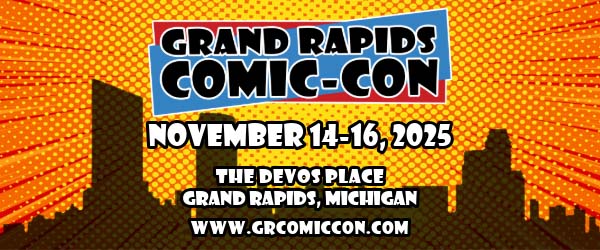
FIRST-I will be at
Grand Rapids Comic
Con Nov 14-16th, and will have a discussion
panel that Saturday at 1:15pm. It's going to
be for artists and writers and on the
importance of always pushing yourself to the
next level creatively and how to. "How to" as
in actual quantifiable things you can do,
as opposed to nebulous crap like finding a
mental headspace or whatever.
*side
note to this, looks like my normal helper can't make
this one, so if you're in the area and willing to help
man the booth for a free ticket and some merch. contact
me at douglaspasz at arseniclullabies.com*
SECOND-
Remember a few
blogs ago when I was talking about art
supplies, and I showed these pencils?
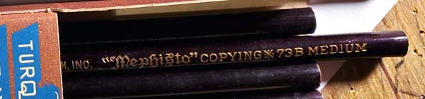
My friend Heather was
vexed enough by them to do some digging and found more
info than I was able to. They were some half assed
precursor to carbon copying. The lead reacted with
water. You'd write with it, dab the paper with a wet sponge
and press another piece of paper onto it to get a copy.
Seems...asinine.
Now...she found much of this
info on this screwball's website, dedicated to...collecting old pencils...
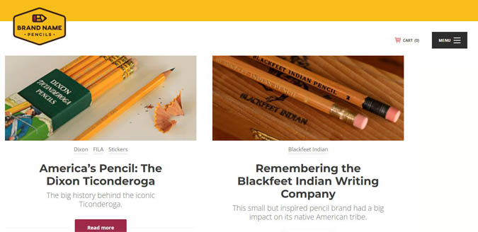
THIS...
is a level of appreciating obscure minutia that swerves
well into not being compatible with your fellow man. I'm
serious. This is not a hobby you pick up and start
making friends, or as an interesting way to pass the
time. It's certainly not fun. "oh a new
pencil, I'll take a picture of it and then put it with
all my other pencils." There's something wrong with
him. And don't give me that "he's not hurting anyone who
cares?"
He's not hurting anyone...YET.
But let's
all take in the level of disconnect of what he is
spending his time on, vs the what the rest of humanity
finds interesting. He's not
really one of US, is he? Sitting alone categorizing
pencils, that's what you do just before you snap.
This is serial killer stuff right here.
Look at this...go ahead. His "about me" section-
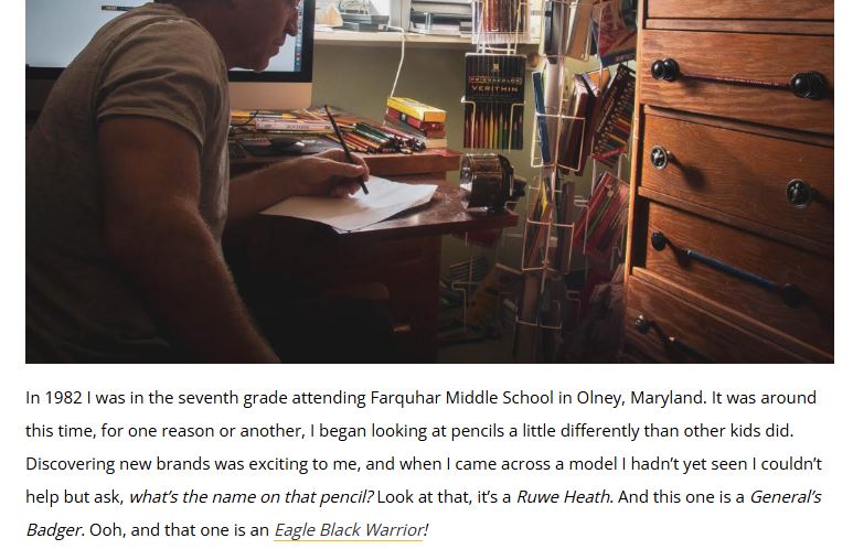
Him sitting alone in the dark...that's what he though that was a
good picture to present to the world. And that part
where in 7th grade he started looking at pencils
differently. Uh...That's the time the sex part of your
brain comes online. That's
when you start looking at girls differently, or guys. He
turned his attention to pencils.
What's that mental illness where you get a sexual
attraction to inanimate objects? some kind of "-ism" or
"-phillia". Dahmer had it.
Then there's
this-
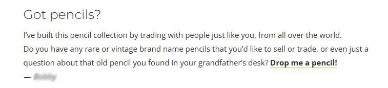
He
gives contact info in case you have one he might want. If you wanted to start killing people, and wanted
a way to find victims who have no one who would
notice they are gone for some time...anyone who'd
respond to that query fit's the bill.
"hello, I saw your
request for discontinued pencils and have several that are
discontinued that..." he could stop reading the email at
that point and know, no one's gonna come looking for
this guy if he goes missing.
The people with
super nitch, weird hobbies, I don't trust them.
-You know, collecting comic books used to fall under
that category.
Hmm...ACTUALLY...it used to
fall under the category of kid stuff, then in drifted
into the category of things appreciated by punks and
anti social types, then it became mainstream cool, and
now...it is allowing itself to drift into the being some
kinda nitch collectable...where the whole industry is
chasing the small percentage of people willing to pay
big money for whatever is deemed an excusive, or that
they can convince has some value to it beyond what it
actually is...a comic book. A means of mass
communicating a story.
This industry keeps
teetering on having an image that it is only for super
nerds and that is a bigger barrier to getting new people
interested than anything else. Talk about why the story
is great and you can get anyone interested in picking up
the comic, talk about how it's deluxe variant draw by
"enter name of illustrator no normal person ever
heard of" and you only get a part- of a part -of a
part of the people who already read comics.
A
very successful business owner I know said to me many
years ago "it's better to have 100 customers paying
1.00 than 1 customer paying 100.00". That shouldn't
require an explanation. The former allows for massive
growth, the latter means you are one customer away from
being f*cked.
Back to this crack pot who
collects pencils.
-You found this guy because you collect pencils.
...I don't collect pencils. I use them to earn
a living. And I got the ones in question because they
said "Mephisto" on them. That's metal AF, bro.
Now, I forgot what my
point was. I was going to go into something about how
civilization is so safe now that people are left with
obsessing over minutia, or something like that. I don't remember
anymore...
Actually...You know what this is? This collecting
pencils nonsense...this is what you spend your time
doing for awhile because your 12step program said to
stop hanging around with your old friends and going to
places and doing things you did while you were drinking.
And you do this until one day you unwrap a pencil you
got in the mail...stare at it...blink, and wake up in a
hotel room with an empty bottle of Jack Daniels in one
hand and the other one draped over a hooker.
That's what on the horizon for this pencil guy. Booze,
hookers and probably dead bodies.
Now then...I am going to do something I rarely do in an
ARSENIC LULLABY UPDATE, and that is talk about an
upcoming Arsenic Lullaby project.
-Holy sh*t you're actually going to give us what we signed up for in
the first place?!
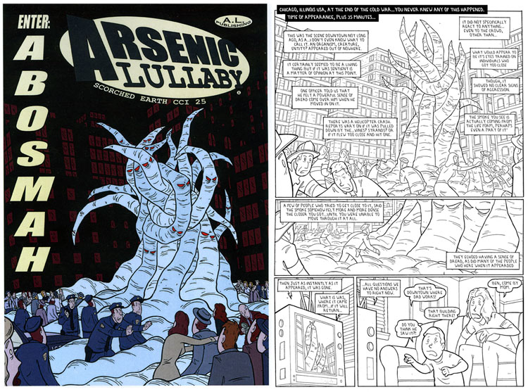
In a way...the next comic will be out soon, All the
nuts and bolts business infrastructure stuff is
figured out...publishing, distributor, how often
each issue will come out ect. More on that some
other time.
It is going to be an ongoing series, as in one
long continuing story. Something I've not done
before, because I've never had a story that required
more than one issue, or even an entire issue. I
won't be showing much of it until it's really time
to start plugging because, if your one of the
fortunate souls who go a copy of the first chapter
from me at Comic-Con you'll know, even seeing page
two could be considered a spoiler. I'm going to
remain very tight lipped about the story, but what
anyone could gleam from the cover and first page
is... obviously
it is a crime noir romance.
Protect your art from AI with Glaze
or
Nightshade
All I'm willing to say is that it's really good. One
of the best things I've ever done. I'd call it THE
best, but Arsenic Lullaby no.2 is still ahead
overall, by
just a hair. I may never top that one. So take all
that for what you feel its worth. The working title
is "Enter Abosmah", it'll be 120 or so pages all
said and done, and several reoccurring characters
from previous Arsenic Lullaby stories will be
heavily involved.
Anyways,
like I mentioned before...different people
approach writing differently. Most set up a timeline
or have a chapter breakdown, or list of highpoints.
I just have the story in my head and do my best to
put it onto paper. Not a lot of overthinking or
intense arranging of things. More like if I saw
something funny happen at the grocery store and then
told you about it. I know what the story is...and
that's that. It's just instead of my eyes and ears
having seen something happen, my imagination decided
what was what.
Which makes trying to transfer
it to paper a little like trying to remember a
dream.
WHICH...brings us to back to me trying to make a
decision of
it being in black and white or color. They'll be a
little bit of how-to here, but a lot of the
following is going to be me thinking out lot about
visual storytelling to maybe swerve myself into a
decision.
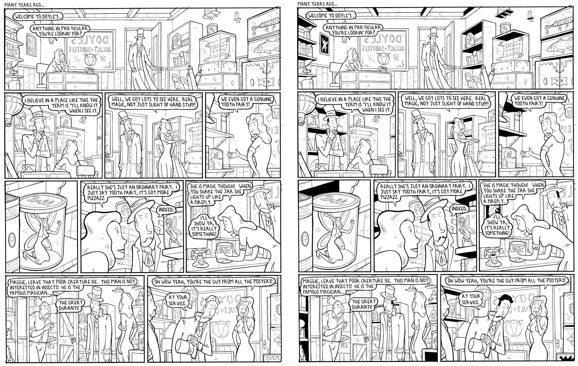
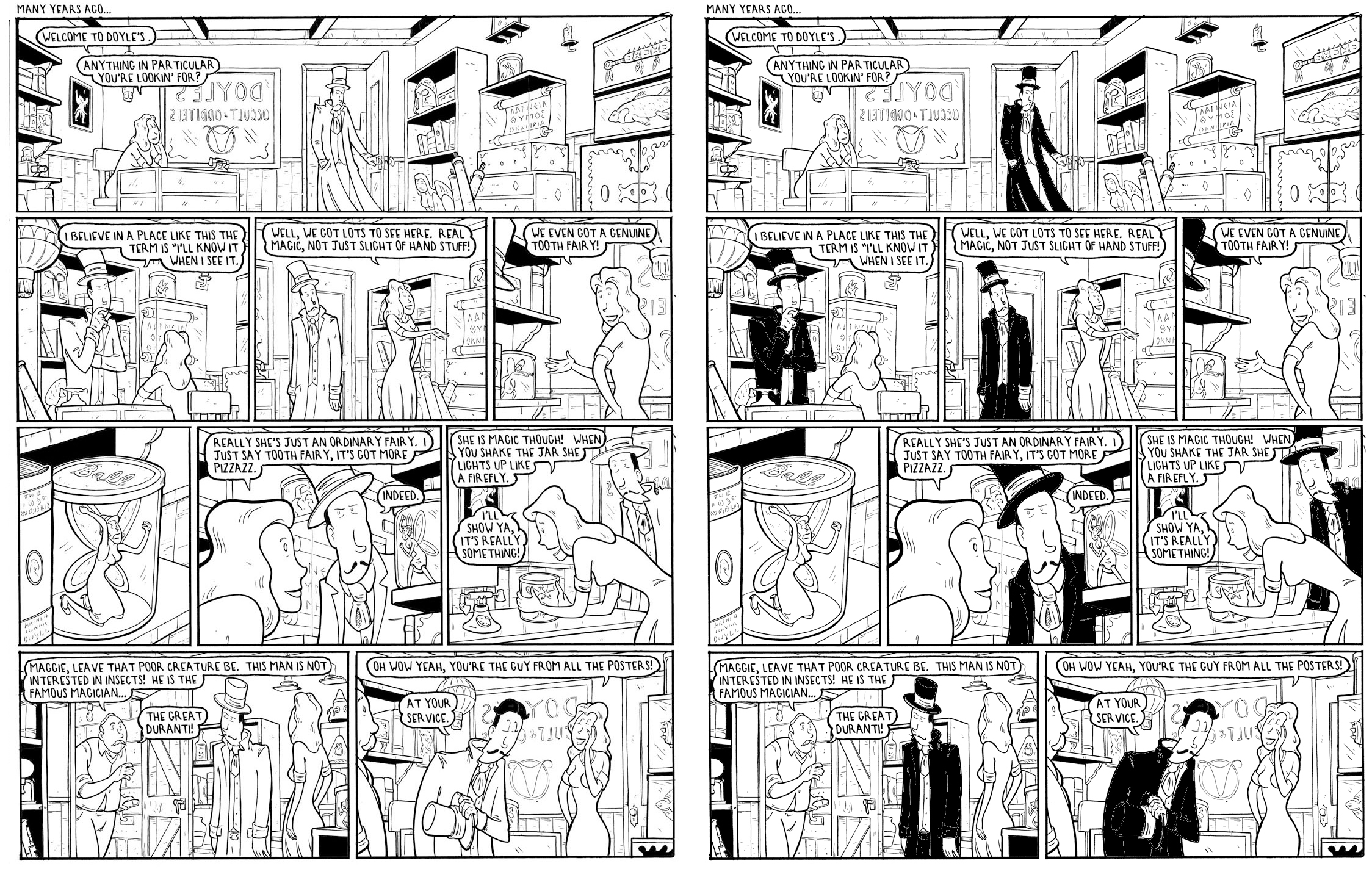
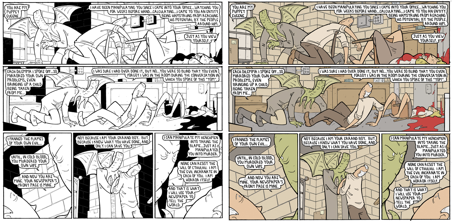
Black and white feels more right for the story than any coloring I've done. To
me, black and white comics have an energy, impact, edge,
look to them that really works well for certain stories.
These pages below...(they're shown a bit on the small
side, because all we're paying attention to now is- if
and why they grab us). They could be colored but that
wouldn't make them any better visually, and in fact
might rob them of some of the elements I just listed...
On the other hand...how much of my thinking here is
based on nostalgia? I don't honestly know. Also, could
be there is just a type of person who appreciates/absorbs
creative things differently than others. People who
like black and white movies, or people who like acoustic
music for instance. That does seem to be the case...which puts any
black and white book in a nitch, and mine being
horror/comedy, it'd be a nitch inside of a nitch. A
challenging place to be in to grab an audience.
BUT...then there's Manga comics ( Japanese comic books,
translated into English and distributed here)
and they sell LOADS of copies. They are BIG BIG sellers,
and they are almost all in back and white.
So...potential audience wise...either decision is
probably fine and it comes down to execution. However, If I go black and white I have to
change my m.o. of overly delicate lies and details and
add more punch.
Recapping...there's a few ways to
punch up the B/W pages. Some kind of zip a tone pattern,
spotted blacks, cross hatching.
Spotted blacks
(solid areas of black) are what I've used most in the
past and am most comfortable with trying. As much as my ego balks at
covering up details and feels like large areas of black take
away from the craftsmanship...my page on the right does
look a hell of a lot better than the version on the left.
Protect your art from AI with Glaze
or
Nightshade
It just does...it grabs you more. And I don't even
need to go with that much black. A spot or two here and
the makes a pretty big difference.
Protect your art from AI with Glaze
or
Nightshade
In that page above, I could have also
used spotted blacks for one or more of the characters
clothing. Like say, Durante's hat and coat. That
brings us to one problem
with spotting blacks- the technique can end up at odds
with the storytelling. We'll make his coat
and hat black and give it a look
so I can explain...
Protect your art from AI with Glaze
or
Nightshade
Definitely a more striking version but now
you end up giving all the visual emphasis to one figure,
even though he may not be want you want the reader to be
paying attention to.
One thing I haven't gotten
into before when explaining plotting out panels and page
composition to lead the readers eye to where you want it
to go, is that there's times when it's just as important
to give the readers eye free range...let it decide what
to notice.
You stand up comics who read these
blogs can vouch for this- some audiences are smart so
you can be subtle, some are stupid so you have to spell
things out, some people react the most to the premise
and cadence, some to expressions and acting. Different
people get a different impact from different aspects of any given joke.
So as much as you can adjust on the fly to the audience
in front of you, there's no way to lean into the best way
to perform for each individual person so that the joke gets
the most impact for everyone.
But, in a comic
book, if
you're careful, you can let different elements find
whichever person they work best for, without them being
missed or overshadowed by another element.
That's a clunkly explanation of the concept...but
I'll show you what I mean.
Lemme...find
an example of a bunch elements presented equally at
once.
This scene here's a punchline from a page.
For the sake of our discussion, the set up doesn't
matter...
Protect your art from AI with Glaze
or
Nightshade
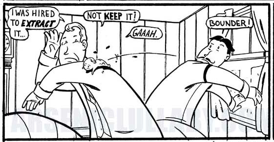
One type person might find the fetus hitting the guy
to be what's funny, another might find the doc's
expression and posture to be funny, and another might
find the guy's expression and throw to be funny, I
could have split this into three different panels. One
with the throw, one with the fetus landing, one with the
doc's reaction. but
that would have dragged it out, ruined the timing and swerved a bit into
"two jokes on a joke". But set up like this...without
any real emphasis on one element over another, the
readers own brain finds what gives it a jolt.
Actually, this page here is a better example. It's one
most of you have probably seen. In lue of a live
audience, I pay attention to what hits harder than
something else when people are at my booth at a
convention. I've been to hundreds and watched probably
thousands of people react to this one...
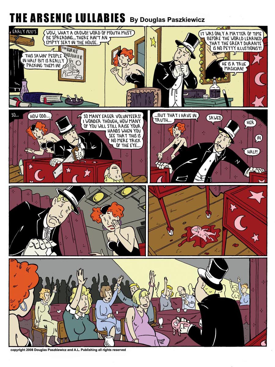
It's a real solid gag and one I can count of to
evoke a laugh (barring those with a delicate
dispositions who came to the booth by some cruel twist
of fate). Now when they get to that last panel,
some laugh at the premise, some will point to the right
hand side and say " Ha! He's raising her hand" Some will
take notice of it slumped over the magicians hand and
say something like "Awww...hahahaha poor little guy!".
Point being, I gave their eye no real focal point, so
their brain noticed what jolts it. It got optimal punch
from all kinds of different personality types.
That panel is laid out in such a way as to instead of
point the eye at one thing, bounce it around the
panel...and so it did and stopped at what hit for it.
How I did that...I'm not interested in explaining. It's
another instance of "I taught you everything you know,
not everything I know"
Anyhoo, that's why, in some cases, I tend to not force things
visually, and have panels that have a lot going on.
Several elements are out there equally for each reader
to get the knee jerk reaction from, rather than having
one aspect in the position to take center stage in their
brains. That also helps in getting them engrossed in a
story. Let's look at this one panel out
of context, as is....
Protect your art from AI with Glaze
or
Nightshade
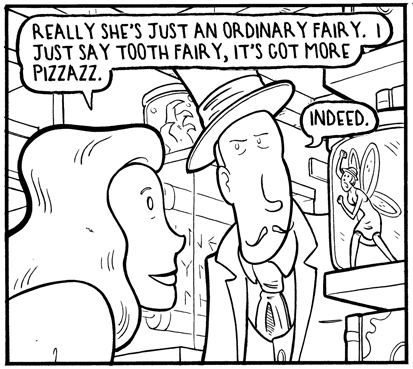
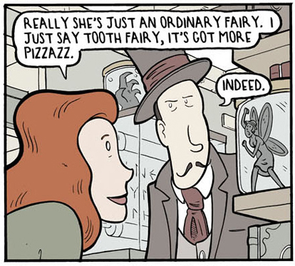
Now let's look at it with the spotted blacks used
differently. Each one is nudging the reader into a
slightly different story. If we're looking at Durante's
expression, or the Woman's, or the plight of the
fairy...it's a difference scene each way.
Protect your art from AI with Glaze
or
Nightshade
Each person might find a different perspective more
interesting and I'd be neutering them noticing it/the
impact of it, if all the emphasis is on some other
element because of the placement of spotted blacks.
So there's that. Spotted blacks
are tricky, and if the point here is capturing the
imagination/telling a story,
for the new story I'm working on my usual muted coloring might get the job done better
when all is said and done.
Protect your art from AI with Glaze
or
Nightshade
Now,
let's talk some about
shadows, and I'll get into why I don't think its a
fantastic idea for the story I'm working on. You got 2 basic kinds of
shadows. You got your shadows that give
things form and weight like this below.
Which I avoid because I like the sort of flat, parallax
look (example below), where something is either all
black or it's not. Which may be a look that's "dated"
or "retro" depending on your disposition. However, this
story is set at the end of the cold war so...it'll fit
the vibe even if it seems "retro".
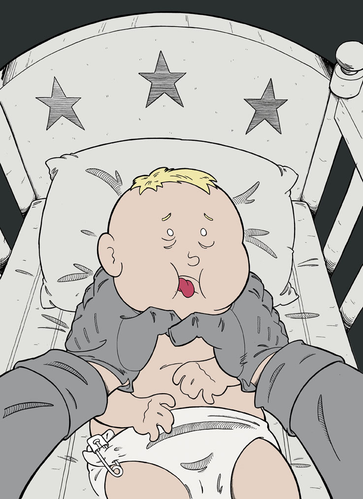
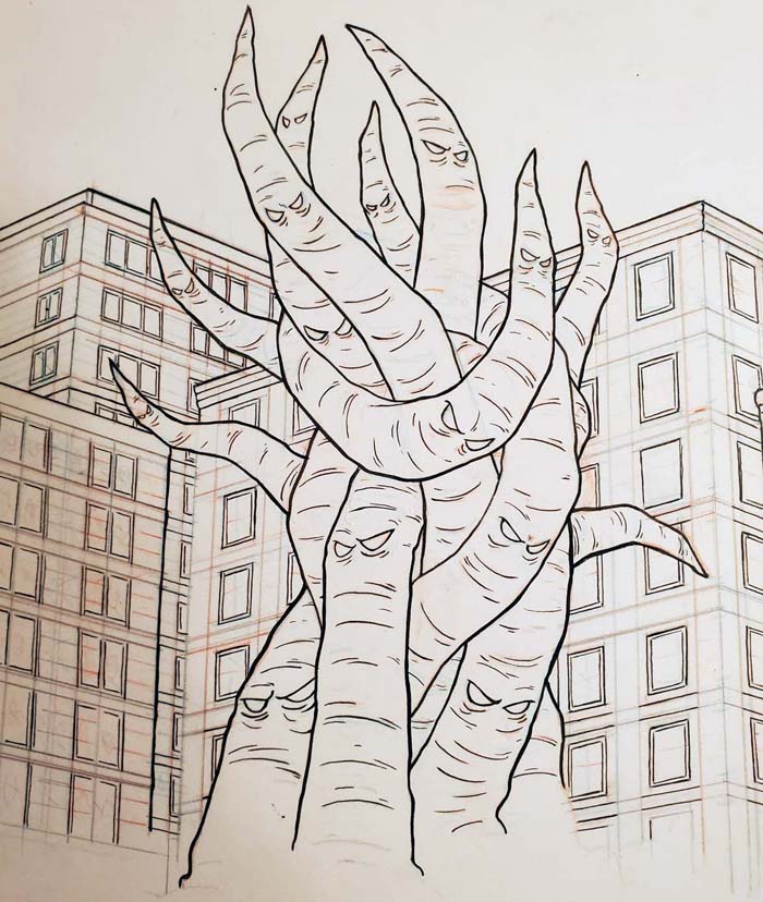
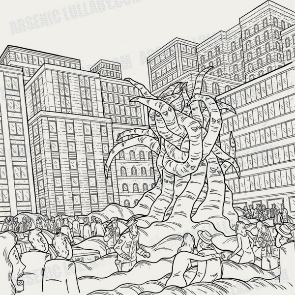
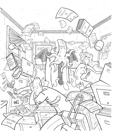
Apart from my own preference on what's cool visually. The monster in this series is complicated as
hell to begin with and adding shadows might make him a
visual mess.
Protect your art from AI with Glaze
or
Nightshade
Then we got the option of cast shadows. A
nice long shadow coming off a character does wonders for
horror.
But sometimes it's...too smart by
half. There
are times that less is more as far as visual
storytelling.
There's
a thing Mel Gibson said once that applies
here.
-Thing he said while he
was drunk and screaming at the cop?
No. Not the thing he said while...
-The drunk rant he left on his wife's
answering machine?
...would you
quit screwing around. I'm talking about
something he said while directing Apocalypto.
Although, I was thinking the other day.
Which is the more colossal fail at trying to cancel
someone, the Mel Gibson thing or Charlie Sheen? Like, I
know this was the stone age of cancelling but still,
these where both such catastrophic backfires that It's
amazing that the concept of cancelling ever found it's
footing afterwards.
Charlie Sheen's popularity exploded to
John Lennon levels and Mel Gibson put out
Apocalypto
right after all of that, and is
still making movies whenever he tf feels
like it. And the interesting thing is
they used completely opposite responses to
the attempts...
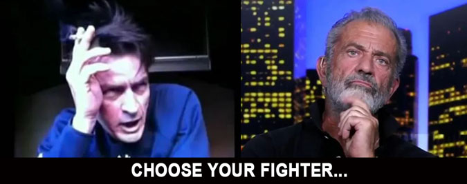
Charlie Sheen basically said "yeah I
beat that hooker, I was on cocaine, I'm a
mad man! Whoooo! Come see me at madison
square garden!" And Gibson more or less
went "...so anyways, I got a new movie
coming out." The underlying thing that shielded them both was
that the truth has a certain ring to it. I don't mean
the truth of what kind people they are, I never met
either one of these guys. They could be saints who were
just going through some bad times, or they could be
complete pieces of crap. I mean the truth of them
genuinely not giving f*ck.
I often try to
explain to people that much of life boils down to sheer
force of will. I've been involved in projects that
realistically had little chance of success but the
people involved were just locked into the mindset that
this IS GOING TO WORK, and so it did. The other end of
that coin, the ying to that yang, is the sheer force of
not giving a f*ck. Two powerful elements in our
universe.
I'm way off the point
here.
Back to what Gibson said
while
Apocalypto was being filmed. One of the actors was trying to figure out
how to behave physically so he would be
scary. And Gibson said (I am paraphrasing)...stop trying to do
anything...the make up department already
took care of that. You just standing there
are terrifying, any affectations you add
will take away from that.

The bottom line is that there is a point
where too much is too much. This is
defiantly a rule of thumb in comedy and
horror. Over explaining, overdoing...it can
all completely neuter the joke or the scare.
In the case of the new Arsenic
Lullaby story, and it's main character...
Protect your art from AI with Glaze
or
Nightshade
scary
shadows aren't really called for and might
be too much.
Abosmah, no differently lit than anyone normally would
be, I feel makes at all creepier. No visual affects added to
make anything seem off...the only thing out of the
ordinary is him.
------------
Gibson's
specific point, don't overdo it, can be
monitored by keeping in mind what the story is that
you're telling. Most all of stories have their bedrock in personality. I
make sure I know the personalities in the
story, know how they'd behave in the situation
they are in and try to keep any elements of the story,
visual or otherwise, true to that.
So, if I'd been drawing Apacolypto as a comic book, I would also not have had they
guy act scary, because that is not the
personality he is. This person has nothing
to prove.
He is results driven. In this case he
means to murder someone, and so that is all
he is concerned with and would not be
putting on airs to intimidate anyone.

Him acting menacing would have been over the top, and
taken the character from being scary to feeling like
someone we're supposed to think is scary.
All of
that boiling down to, I don't feel
like a bunch of scary shadows it what's called for in
the new story.
Anyways...all this thinking out loud has turned this
email into a bit of mess. I'll
give you a rundown of the how-to of drawing things
casting shadows and you'll see why it's
a "is the squeeze worth the juice?" situation, to quote
one of my favorite youtubers
JustinTaylor (there, I've
plugged another one, I'll have given all of them a nod
after a dozen more of these).
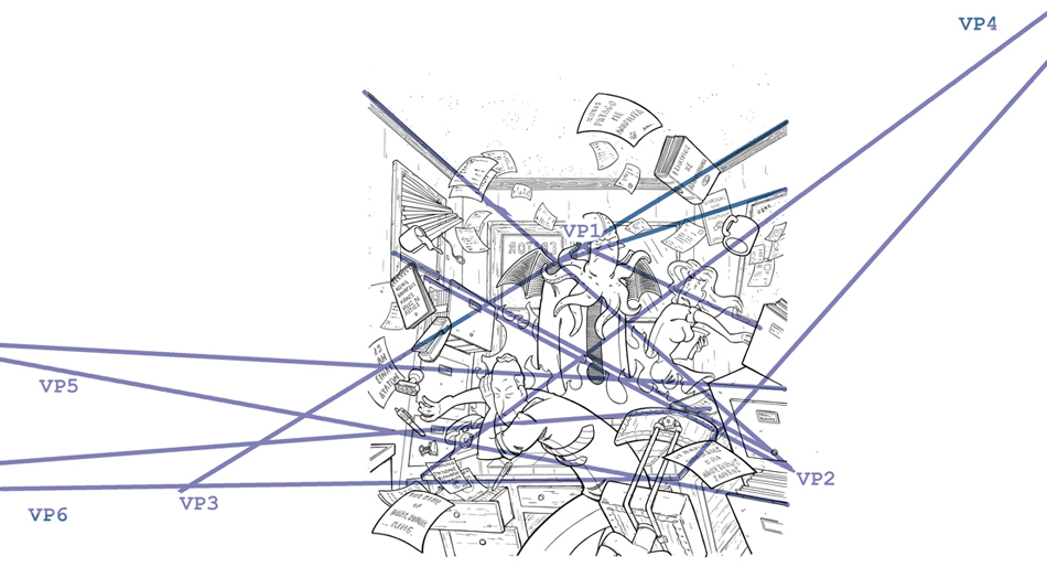
It's all an
offshoot of what vanishing points are for. A lot of
people avoid learning how to draw in perspective because
it seem/sounds/looks complicated. But's truly very
simple. You got your "horizon line" (eye level of the
camera) and a vanishing point to the left and right. You
add more vanishing points for extreme camera angles and
such, that is basically all there is to know. If you can
get your head around this picture you know 90% of
everything you'll ever need to know about it.
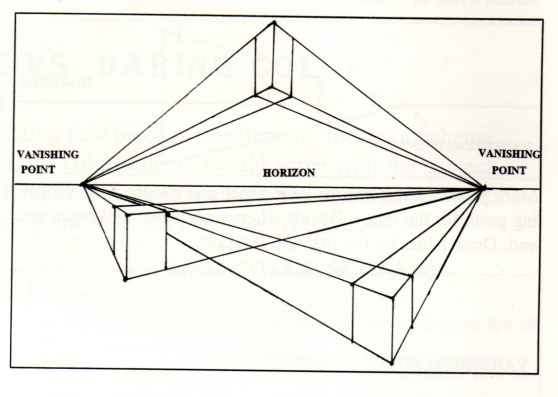
For cast shadows you're just adding another point
for the light source. We'll start with a
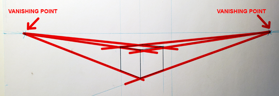
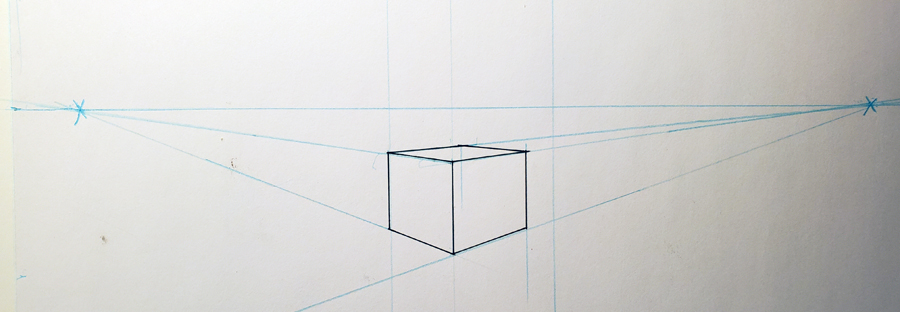
simple cube drawn in two point perspective. You got your
horizon line, pick a vanishing point for each side and
there you go...
Having this cube cast a shadow requires adding another visual
point that lines go to...that point being whatever/where ever
the light source is...
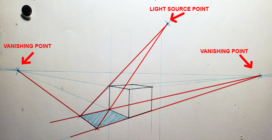
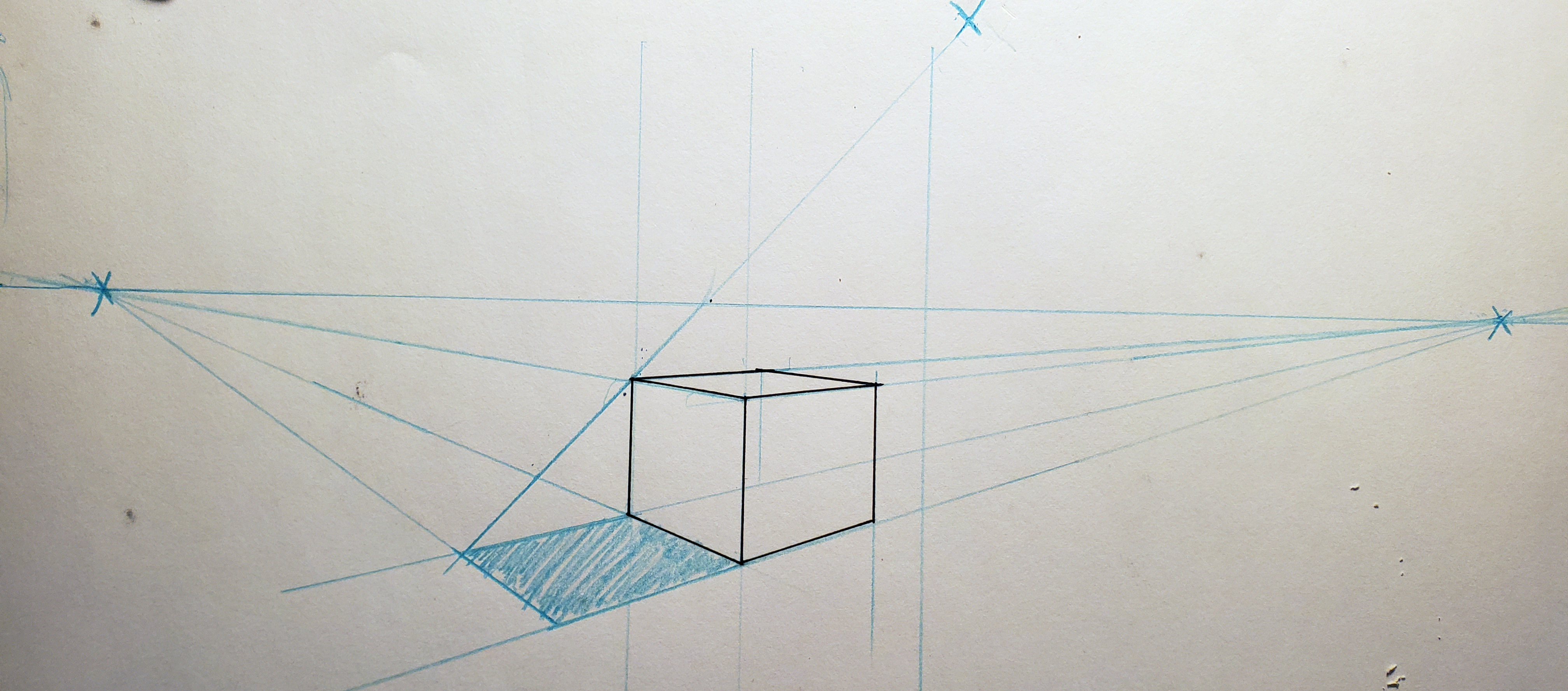
NO...wait. That is wrong. Something's missing. Lemme
try to remember...
Oh yeah. You actually need two visual
points for a shadow. The light source point and a point
straight down from it, on the floor/ground/surface.
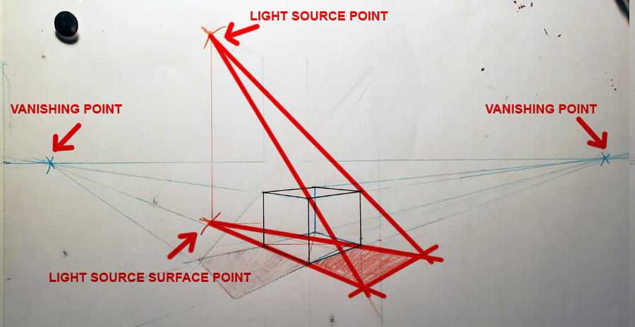
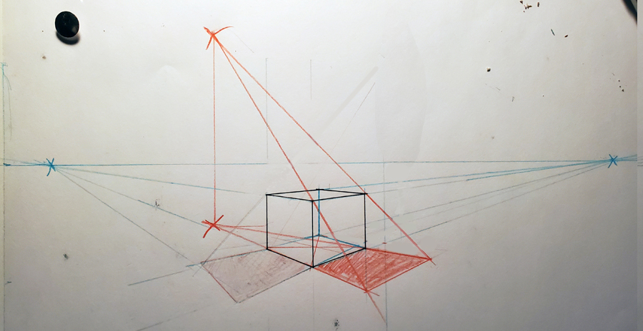
I think...that's it. I dunno. Where's my damn book.
Hold on...
here we are...
Creative perspective for artists and illustrators-
Earnest W Watson
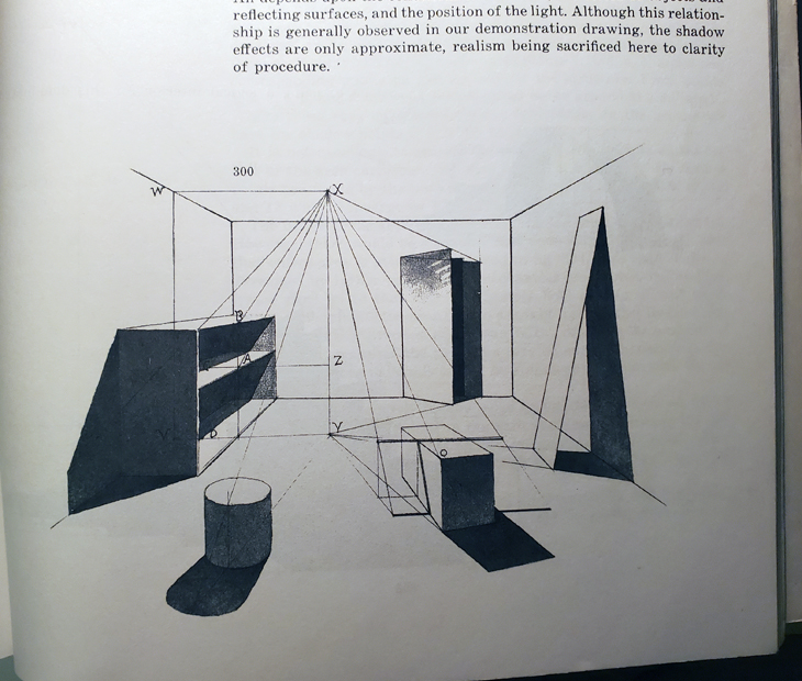
I pretty much remembered it right. Anyways, that's how
you're supposed to do it. Which is a hell of a lot of
screwing around. Having said that, I don't know
anyone who actually does it like this. They just take a
guess based on where the light would be coming from or
put the shadow where it'd look cool. And there's really
nothing wrong with doing it like that. If it looks good,
who cares.
I
however, as long term readers to this blog will know, am
sadly not wired to just BS my way around with perspective,
and say "it looks cool, who cares". I regularly drive myself insane holding my work to a level of
precision that is completely unnecessary... to the point of
having different vanishing points for different objects
if
they are falling or leaning because technically
that's the correct way of doing it.
Protect your art from AI with Glaze
or
Nightshade
I have no earthy idea why I am like this in this
one single solitary aspect of life. I am normally hard
down in the philosophy of "if it's a stupid rule, ignore
it". Yet I have some compulsion to adhere to drawing
things in perspective, by the rules. and so...If I start using cast shadows, odds are
this book will never get done and I'll end up in an
insane asylum.
And...I've ended upright back at the start, where
just coloring the thing makes the most sense. I dunno.
Protect your art from AI with Glaze
or
Nightshade
Anyways...see you in
Michigan or here next time. Until then, here's some
comics.

 |
ARSENIC LULLABY ONLINE STORE
TEMPORARILY OPEN
10.00 off second print with coupon code- 2prints2 |
 |
FIND A COMIC BOOK STORE NEAR YOU
COMIC SHOP LOCATOR
Save
on shipping, find other comics you didn't know
existed...maybe find a bargain. Click on the link
and punch in your zip, code, it'll give ya the
closest place |
 |
SUBSCRIBE TO THE A.L. Email updates
Get a weekly(ish) email from the
writer/illustrator of Arsenic Lullaby.
Some
week's it's a sneak preview, or a long rant, or
news about new projects before we tell anyone
else.
HERE |
|
|