|
|
***If this email looks jacked up in your email window,
click on this link, or copy and paste, to read it on the website***
https://arseniclullabies.com/nl20250806Letpress.html
THIS WEEKS BLOG
Life and lettering protips
and
an unwritten comic book law
Another Comic-Con
International has come and gone. I...am
exhausted...still. Mentally mostly.
I've exhibited at
that show how many years now? I'm pretty
sure I started in 99...or maybe it was 2000, minus the years it did not go
on. I dunno, I've done that show a lot. Since
way back when it was a medium sized convention
bringing in a scant 50,000 attendees. It has grown
in recent years to 130,000 plus.
I am continually amazed at the sheer
logistic mastery the CCI staff has to organize all
it all. It should look like the fall of Saigon, but
it's comes off without a hitch. I have enough
trouble getting one booth together.
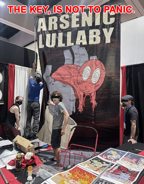
Say...wait a
minute...in that above pic...Is it just me or is, at
this critical juncture, with my focus being on
tightening one side, and despite my hearing "yeah,
we got it."...is no one actually holding the rest of
it up?
In anycase, I've seen lots of
change at Comic-Con.
There were differences at the
show this year, both in general and specifically,
industry things well worth noting, important things that jumped
right out at anyone bothering to pay attention. BUT,
I'm not going to get into them right now because my
brain is still fried.
Couldn't someone else do
it? Maybe one of the comic book related websites who
had people there, could shift gears from the usual
showing of of exclusives and that type of scoop, and give a
little boots on the ground, nuts and bolts - Here's what was
different, here's what wasn't there, here's
what replaced it, and here's what it could all mean.
I understand it's generally not your thing, but
trust me...more people find it interesting, than
you'd think.
I have yet to seen such reporting, but if
someone has, I'd be happy to get a link to
it. So, I don't have to.
Anyways...today, I'm going to talk about
comics, and how they are made...because that's
what I'm supposed to be doing here. And that's
as much as my brain can handle. Oh, one
highlight for our booth at CCI was this new
recruit, who should give us all hope for the
future.
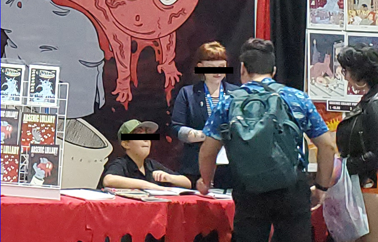
He came by a couple of times on Saturday,
picked up some books...and came back Sunday
asking if he could help at the booth, because he
was bored with the rest of the show. If that
don't warm your heart I don't what would.
I asked him how old he was, and he looked me
right in the eyes, smiled and said "Seventeen".
I said to myself "oh yeah, I can work this
kid."If nothing else, I figure he's
safer behind our booth than being in arms reach
of some 40yr old dressed as Superman. I don't
trust that guy. I realize I'm on the buzzkill
end of the spectrum as far as cosplaying goes,
but can we have a consensus on what age someone
who dressed up in costume, knowing there's an
opportunity for children they're not related to
to hug them, is a red flag? Clowns, Boy scout
leaders, guys cosplaying...if their kid ain't
also involved in the event/activity, it's a red
flag as far as I'm concerned. I give little more
leeway to female cosplayers, because I've never
seen footage of a woman being ambushed by Chris
Hansen's camera crew and being asked why they
were setting up a meeting with a 12 year old.
...I suppose we can give a pass to
celebrities who cosplay as a way to see the show
without constantly being hounded. Although, I
imagine after an hour or two of sweating through
a hobgoblin mask, both options are equally
distasteful. Were I in that position, I would
just walk around and constantly tell people "f*ck
off I'm busy", but that's just me.
As a credit to family of the kid who helped us
out, one of them did
come by to check on him, and maybe make sure he
wasn't underfoot. We of course told them he was
a delight to have around and causing no trouble
what so ever...
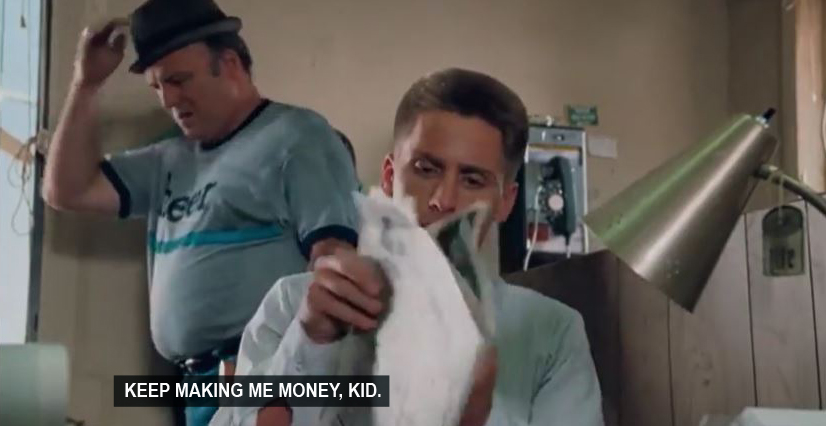
Moving right along, I must thank all my friends who
helped at the Arsenic Lullaby booth. It is a well
oiled machine, and we seem like slick pros, but it's
simply me and my friends, and people who love the
comic and helped out and became friends. In
terms of succeeding at anything, a few people around
you, who believe in you, beats every other option.
Without my friends, I could not have
accomplished any of what I have, at this show, in my
career or in
anything else for that matter. Not any of it. Here's
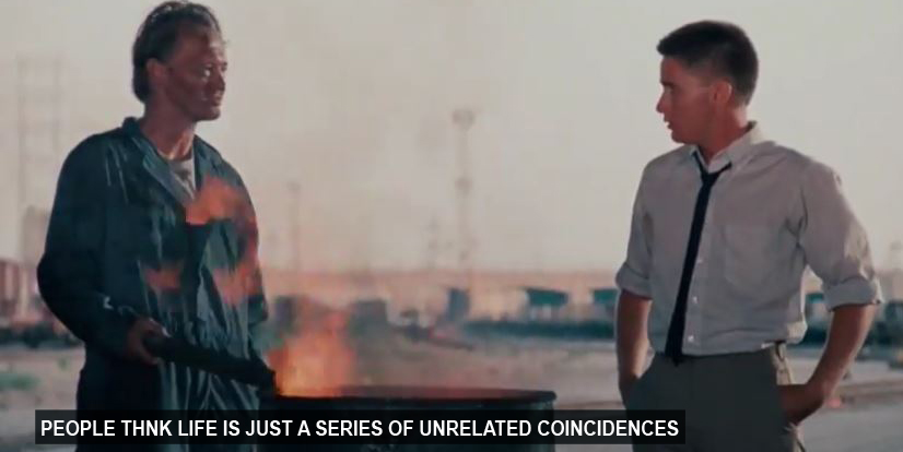
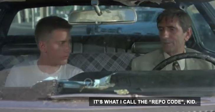
a life #protip for you from Raul Julia...
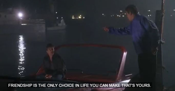
It's the most important choice there is.
I now thank (in random order) Christine, Joe, Josh,
Phoenix, Heather, Emma, Alonso, Zack and Tony.
They did most
of the work at Comic-Con this year in particular,
since I spent the majority of my time drawing
"quick" sketches. I don't know...exactly...how
my contemporaries are able to do a "quick"
sketch in all that chaos. I can draw with people
watching or filming and not be uncomfortable,
but...it does seem to take me longer than everyone
else, in order to do something that looks good.
I've seen other guys do entire pin ups in the
time it takes me to do sketches ...
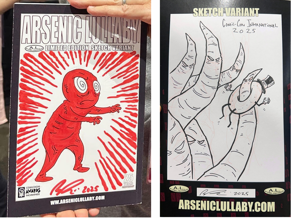
Though, I did bring a red paint pen with me and used
it until it got dry. So, that's twice the work, when
you really think about it.
This year, for once, I got
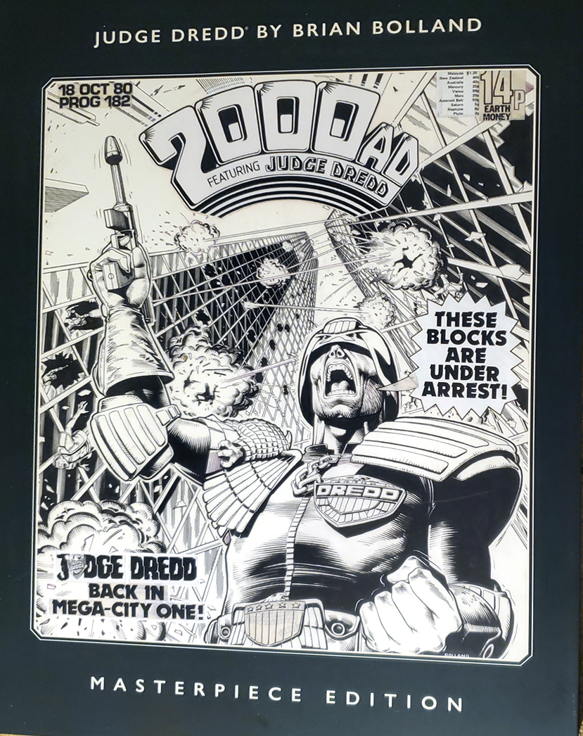
something for myself. A copy of a "masterpiece edition"
(these type collections are sometimes called "artists edition") of Brain Polland's work on
Judge Dredd.
Some of you might not
know, long before Judge Dredd was a crappy movie
with Sylvester Stallone...
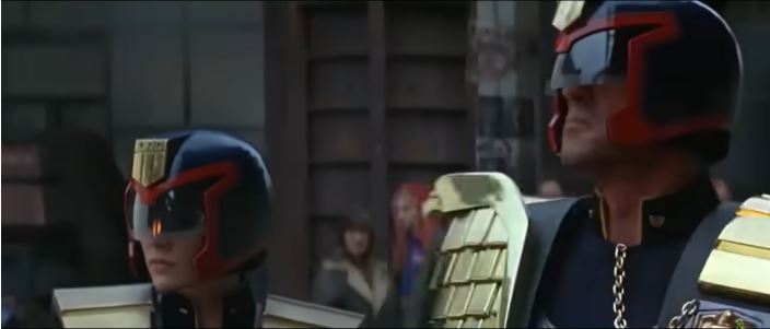
and then a great
movie with Karl Urban...
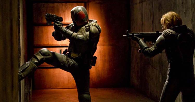
It was first, a great comic,
published in the groundbreaking
2000AD series.
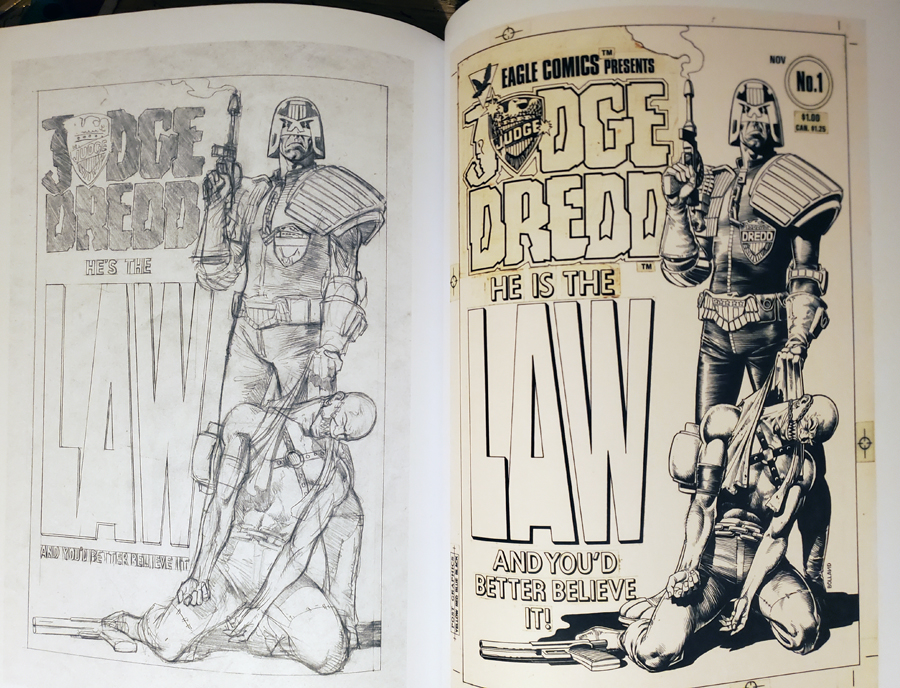
There's a bunch of "Masterpiece editions" from
different companies, focusing on different
works of some uber respected illustrator, on a
particular series, or genre. What they are is printings of the original
artwork, with all the notes, smudges, glued on logos,
right there to see, and often preliminary sketches side by side
with finished work.
They are very cool as far as seeing how the
sausage is made and even just as a
collection of the best stories by someone. Normally
though, they are printed at the original drawn
size (11x17) or close to it, and in hardcover and
THAT... looks cool on the shelf, but sucks to
actually read or look through. It's awkward, feels
like you are a 5yr old holding an encyclopedia. This
one's magazine sized, much more manageable.
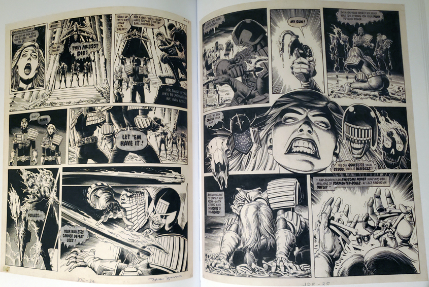
Polland's line work is amazing, so is his
visual storytelling, but what struck me as
interesting here was the dialogue/word balloons. WAY back in
the day, the word balloons were lettered right onto
the original art, then there was a transitional
period (here, for instance) where they done
separately and glued
on.
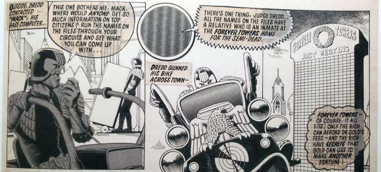
I glued word balloons on for most of A.L. being
published. Now I make them separately, scan them in, and put
them on layered over the scanned art. Most people
these days create the lettering digitally from a
font program, I find that...sterile. Call it
personal preference, but the old hand written
balloons and sound effects just have more life.
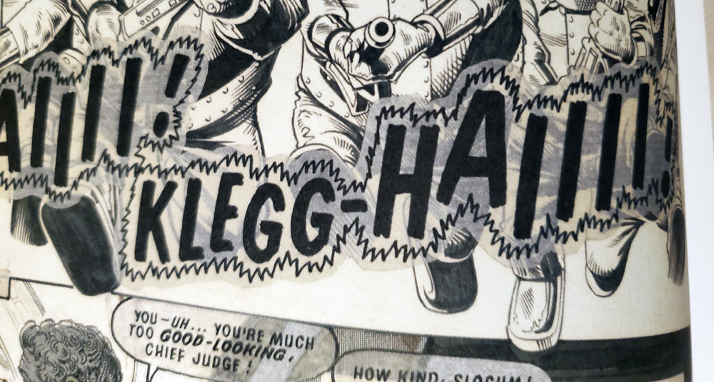
What it seems like went on here, is that
they were drawn on blank zip-tone. Uhm...imagine a
transparent sticker sheet you can draw on, then cut
out and stick onto the art. And it looks like in
some cases the lettering was done on thin paper and
spray glued on. That's my educated guess based on the yellowing on some of the balloons.
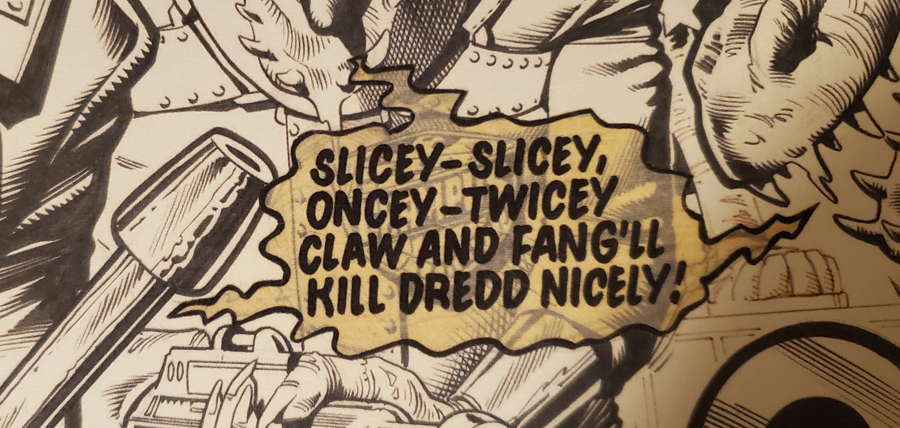
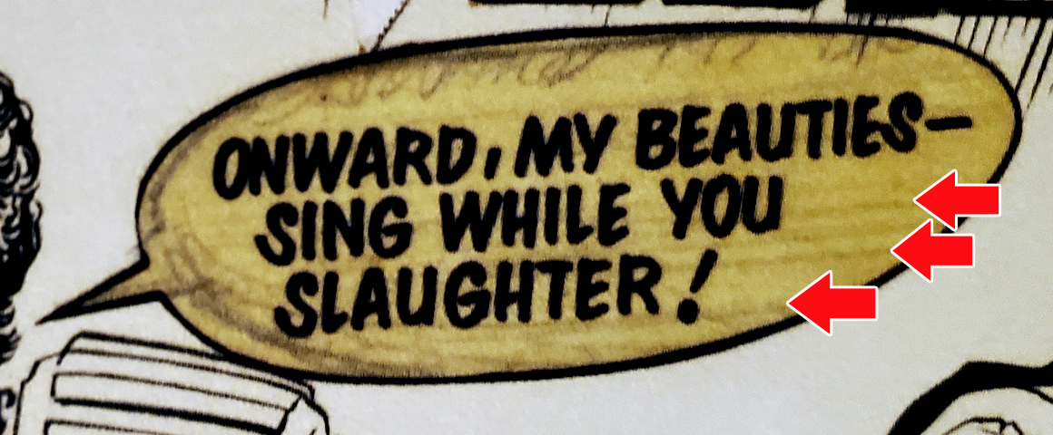
We can see right through most of the balloons,
but this would have been printed in the era when
they used an actual camera to create actual film, so
anything that was under 50% black just would not
show up, like the inking we can see underneath the
balloons.
HERE...if you look close, you can
see the guidelines the letterer used.
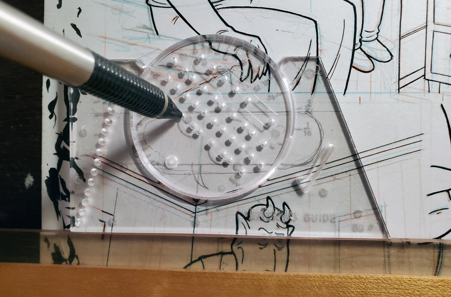
Those are made with one of these things (below), an Ames
Lettering Guide. Which was THE standard tool since,
believe it or not, the 1920's.
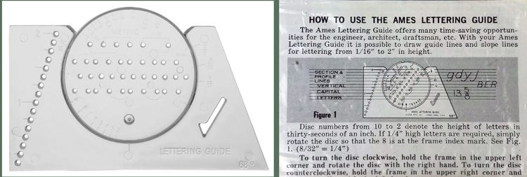
This was the "go to" tool for about 80-90yrs. It
was around that long because it's sort of like a
pump shotgun or the standard wire spring mousetrap,
in that's it's as good as it needs to be and most
attempts at advancement are solutions in search of a
problem.
Using the lettering guide is a
pretty simple procedure. Generally you start
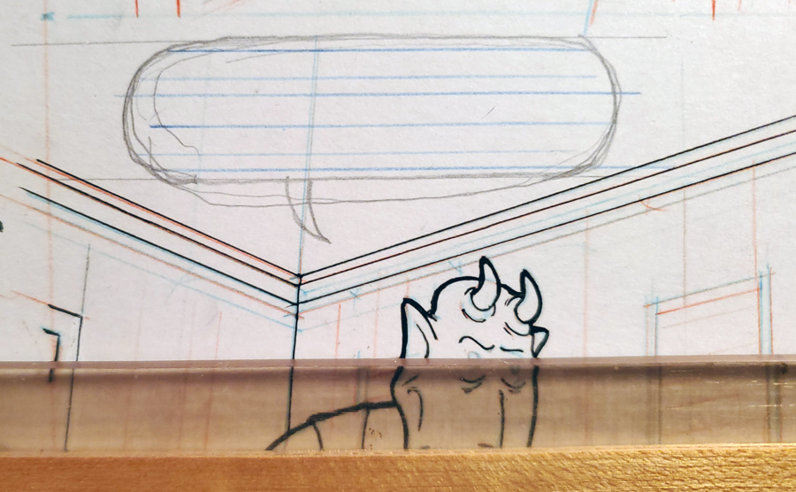
by drawing the balloons in...
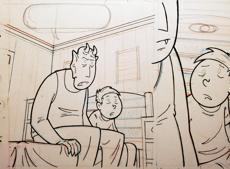
Then line the paper and a T-square up...put the
guide down..
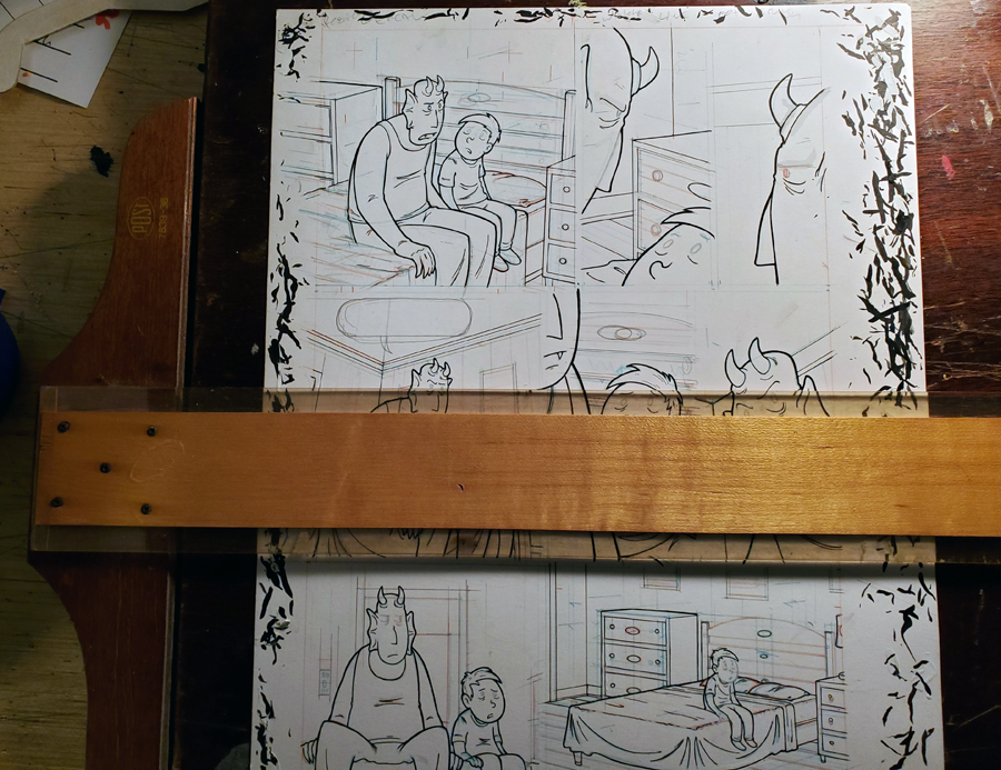
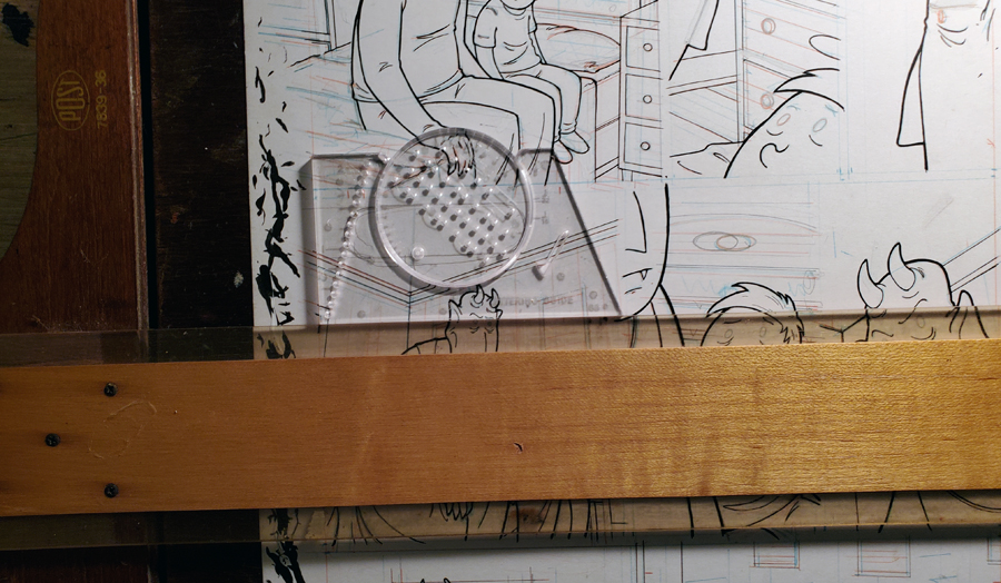
.pick the row of holes that is going to give you
the height of lines/letters you want...stick in the
pencil, slide the guide /draw the line, repeat as
needed. Then you have yourself a standardized set of
lines with which to write the words onto.
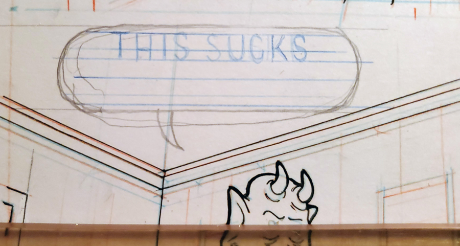
It gets the job done. To my mind, it's a
extra step you don't need. You could just make all
the lines with the T-square, by eyeballing it after
you've got a few issues of lettering under your belt. You'd
get close enough.
The Ames
guide was, pretty much, the go to tool for the unsung skill of
lettering a comic book, until digital lettering got
more common. As a practical solution, I (even in my
steadfastness to old school tools being better)
don't have a problem with people using digital fonts
to create the word balloons, OTHER THAN, they are
often so lacking in flaws and so ununiformed, that
they are conspicuous on the page. They don't feel
like they are part of the same reality as the
illustrations ( I don't have a better way to explain
what I mean by that).
A more important pitfall in using digital lettering is that often the easier something is to do,
the less thought you put into it. And exactly how
the fonts look or precise they are done, as long as
they are easy to read, is about the least important
thing about lettering.
What's important to
remember is that the job of every aspect of making a
comic book is to capture the readers
imagination/tell a story.
It's a team sport
in that regard, and any individual grandstanding in
a team sport can lead to ruin. I'll start with the
illustrating itself, to make that point. The reader
should feel like they are watching something happen,
not looking at a cool drawing. If their first though
is how amazing the art is, you have failed right
from the start. The same as if someone watching a
magician is thinking was how good that magician is
at slight of hand.
take a look at theses page
below, each done by comic book legends. One
makes you think holy crap that is a amazing drawing,
and the other is...something happening.
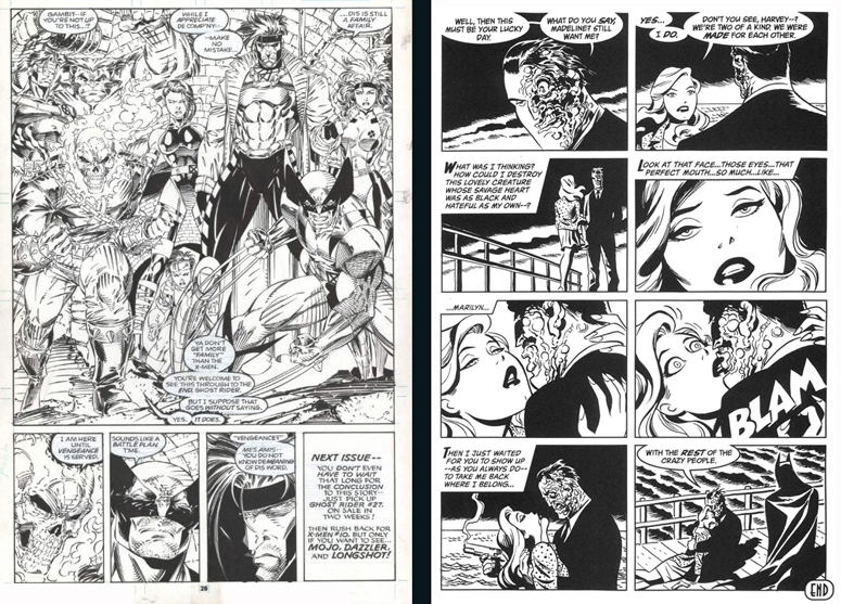
It's not simply one being more detailed than the
other, it is page composition choices, panel
choices, camera shot choices, ect. The one on the
left was done in an era when fanboys went wild over
giant "hero shots", but an old adage comes to mind
"what people say they want and what they really want
can be two different things".
In
capturing the imagination, you want the work you've
put into it to be...invisible, unnoticed, otherwise
the work becomes the focus and not the world/story
you're trying to ply into their minds. Same goes for
coloring, and same goes for lettering.
The
placement of the word balloons is the make or break,
as far as lettering.
The placement of the
word balloons and how you break up the dialogue into
them, can do a lot of heavy lifting in the
storytelling. For one thing, the timing and cadence
of someone speaking in a comic book, is by and large
at the mercy of the reader's interpretation...BUT the
break up and placement of the word balloons does
give you some ability to steer that.
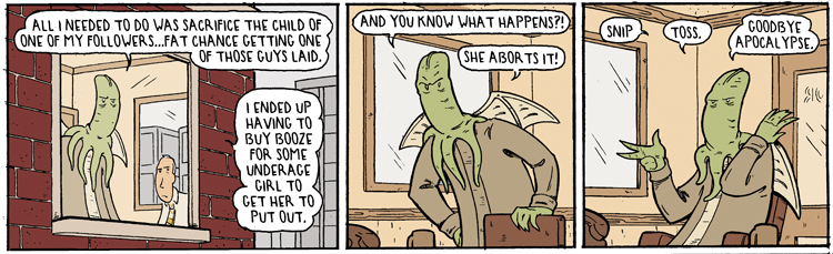
The last
two panels here, for example...could each have
easily had all their dialogue in one word balloon,
but I think you'll agree that broken up into two or
three, drives the point home on cadence, pacing. and
makes the story better.
Protect your art from AI with Glaze
or
Nightshade
The standard, customary, and perfectly legit method
is what Marvel has/had done for decades. Which is
leave a lot of room on the top and bottom of the
row/panel. put all the words of the speakers on the
top or bottom...and all in one word balloon for each
speaker, unless
it's really excessive.
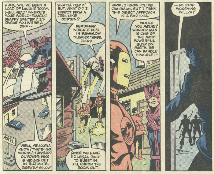
Apart from the cadence being forfeited, this does
not allow the balloons to do much to help the
composition, or lead the readers eye around the
page. They are all touching the boarders of the
panels and are simply not part of the action. They
are visually separate from the illustrations.
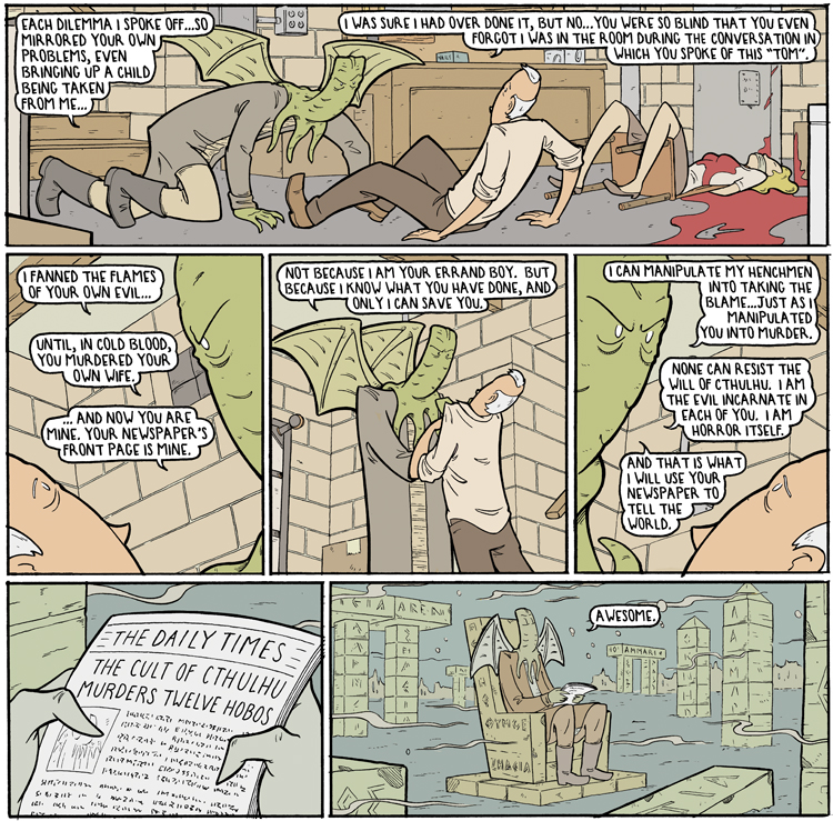
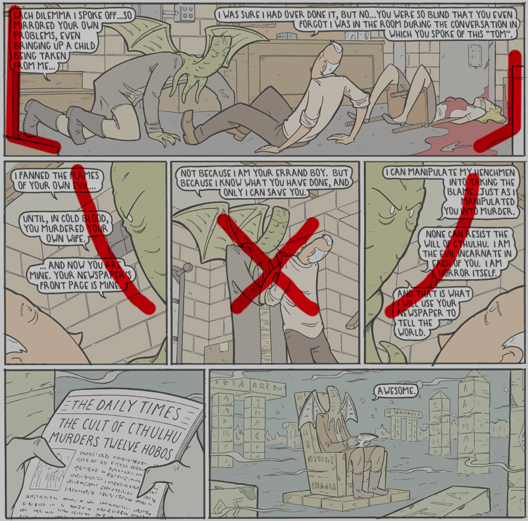
As opposed to the school of thought I, and some
others use. Which is the make them part of the
visual composition. For example below. The visually
important info in the scene, for the sake of the
story, is Cthulhu's physical dominance and
intimidation. And it harms nothing if that is
noticed out of order (the reader can/does see the whole
page at once...even if he/she doesn't read ahead. They will see the dominate visual info as soon as
they turn to that page).
Below, I wanted the composition of
the page to funnel into the visually
important (for tone/mood)panel in the middle- him manhandling the
guy. As far a the tone/mood of the page...that panel
is the bedrock. If they see that out of the corner
of their eye even before reading anything it sets
the tone.
Protect your art from AI with Glaze
or
Nightshade
The background counters, and boxes, and blood,
create the first path to lead the readers eye down
towards the middle. And the word balloons on the two
panels on either side continue that.
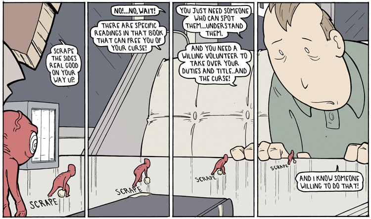
Similar
use of dialogue broken into more than one word
balloon, and arranged for the sake of composition
(below). I wanted a bit of a starburst pattern and
to
also make sure that Joe's tiny menacing henchman
could remain tiny but still be visually
un-ignorable.
Protect your art from AI with Glaze
or
Nightshade
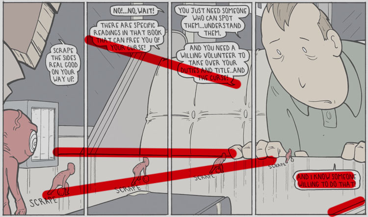
For good measure, that final word balloon is
right next to him. If there is anything on the page
you can count on the readers eye going to, it is the
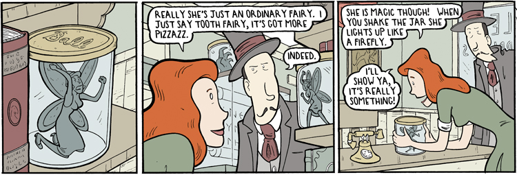
word balloons. Often I'll place them next to
something tiny that I want to make sure the reader
sees. Like the "indeed" in panel two below, being
right next to the struggling fairy.
Protect your art from AI with Glaze
or
Nightshade
Another thing you can do with word balloons,
and their tails, is have
them work together with the implied movement of the
characters, to lead the readers eye around.
Protect your art from AI with Glaze
or
Nightshade
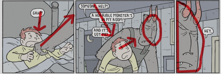
Here (above) in panel one the balloon tail sends
the eye down to Krampus's hand, which sends the readers
eye into the next panel. The word balloons
there guide the eye down to the kids face, who looks
up at Krampus...and what the kid would be seeing is
in the last panel.
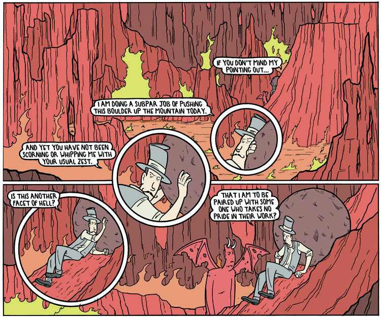
And if you really want to go
nuts, you can use them to give visual order to a
page where you do abstract, wild panel placement.
Protect your art from AI with Glaze
or
Nightshade
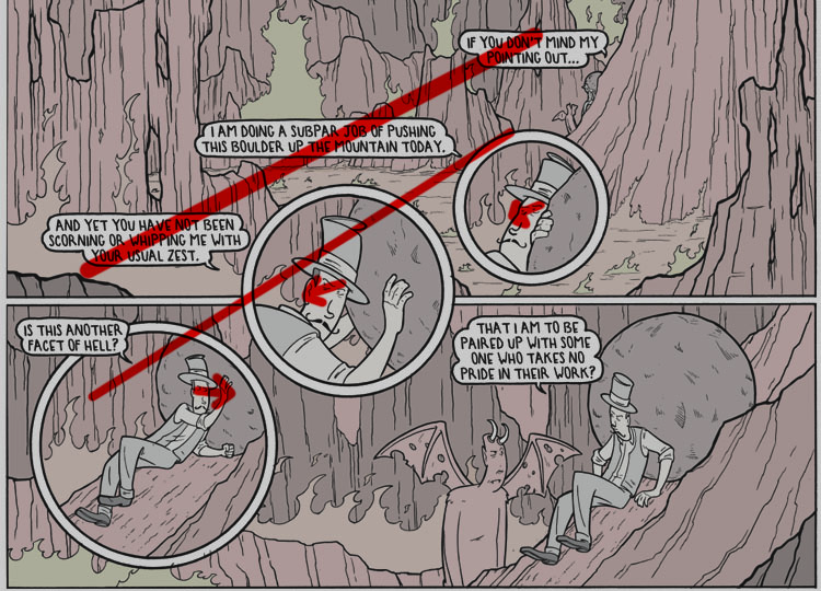
All of what I mentioned not only helps the storytelling,
but makes the balloons part of the visuals, not in
tandem with them.
Overall, the philosophy for me is for the word
balloons to be part of the visual composition, not a
necessary evil. And to divide the dialogue amongst
them in a way that presents the timing and cadence as
true to how it is in my head as possible.
I've given you some
lettering pro-tips here, but again, as the saying goes "I
taught you everything you know...not everything I
know."
Speaking of that, I
need to educate some of you to one of the unwritten
laws of comics...
That is...if you end up publishing a comic, and
you were inspired by me in any way shape or
form...you are REQUIRED...to give me a copy. For
free, with no expectation or request of me plugging
it. You thank me, and give me a copy, and go about
your business. No...wait...you thank me, give me a copy,
buy more of my work as tribute and then go about
your business.
I have a box of these, at
this point. Here's a handful...
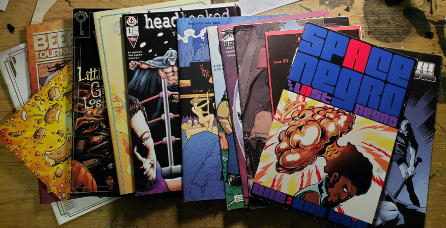
Headlocked", by some guy with a limey last
name? Wonder what ever happened to him.
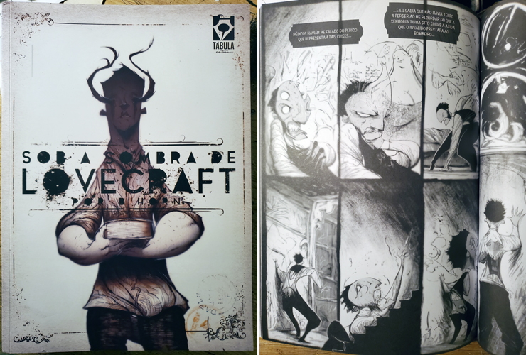
here's a recent few examples...
From
Bertho Horn...
Protect your art from AI with Glaze
or
Nightshade
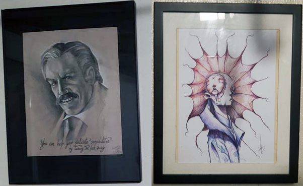
Who also gave me this artwork (below on
right, next to the work of the obscenely skilled
Adam Sward
on the left) ...raising the bar for the rest of you
btw.
(Side note...I'd show more of
Adam's work, but
it keeps getting borrowed and not returned. Petty
theft is a high compliment, I always sez)
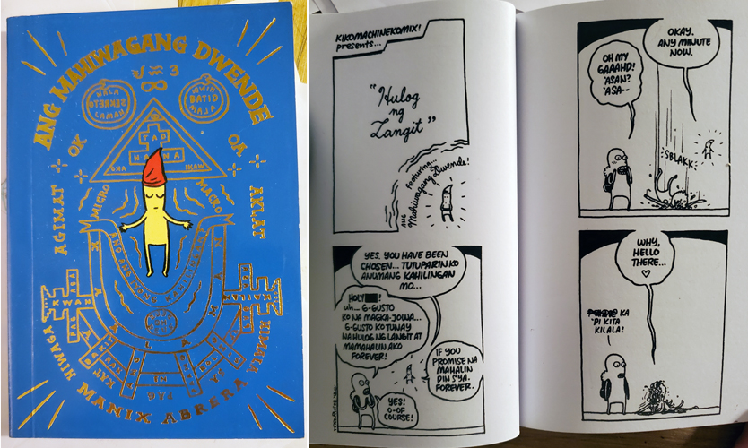
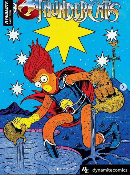
Early work from the Incomparable
Manix Abrera...
Protect your art from AI with Glaze
or
Nightshade
who has gone onto work on a few things you
ugly Americans may have heard off....
Protect your art from AI with Glaze
or
Nightshade
...in tandem with the offering of a free issue, should you become
a
huge success, you are obligated to bring me on board
on some project, and bloviate on about what a legend
I am and what an honor it is to be working with me.
That...is the law.
And...when autographing
it, it should have some personalized message,
conceding that I was an inspiration. Not like this
nonsense from f*cking
Jared...
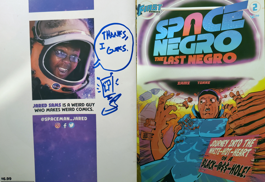
Something brief but sincere...
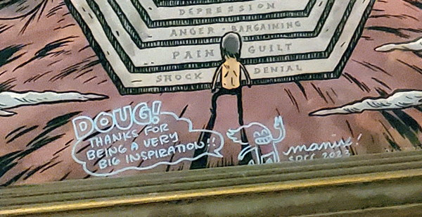
So, if at
the point you become some massive success, and do
not follow through on the second part of your
obligation, I shall shall take to social media
holding up the book with that message of thanks from
you, to me...while holding Nazi flag in the other
hand and hashtags such as #whitesupremacy #ilovehitler #Iinspired(your
name here).
That won't work with Jared, him
being black and all, so I'll have to think of some
other way that being associated with me can damage
him. Besides of course...being associated with me.
anyways...
 |
ARSENIC LULLABY ONLINE STORE
TEMPORARILY OPEN
10.00 off second print with coupon code-
2prints2 |
|
 |
FIND A COMIC
BOOK STORE NEAR YOU
COMIC SHOP LOCATOR
Save
on shipping, find other comics you didn't
know existed...maybe find a bargain. Click
on the link and punch in your zip, code,
it'll give ya the closest place |
|
 |
SUBSCRIBE TO THE A.L. Email updates
Get a weekly(ish) email from the
writer/illustrator of Arsenic Lullaby.
Some
week's it's a sneak preview, or a long rant, or
news about new projects before we tell anyone
else.
HERE |
|
HOMEPAGE
|
|