If this email looks jacked up in your email window,
click on this link to see it on the website
misctechscript.html
Taking a written script and turnig it into a comic book page.
What I'm gonna do today is give you a play by play of me taking
a page of a comic book script and plotting it out into a comic
book page.
Me personally, I pretty much never write scripts, because I
pretty much always draw my own work. So my "script" is a page of
notes of what the important dialogue is and some scribbles of
what I have in mind of the important visuals. Sometimes there
aren't even words...because...I know what they're gonna say,
it's my story.
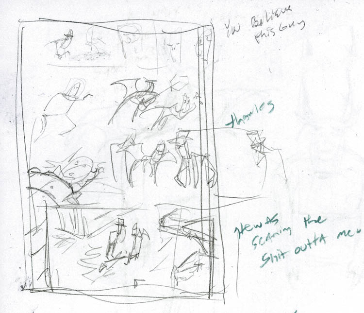
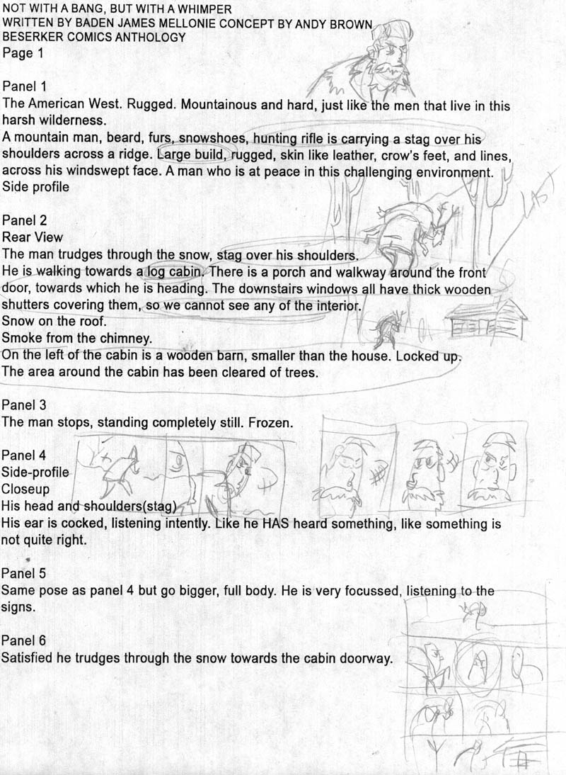
A "script" of mine is usually something like this...
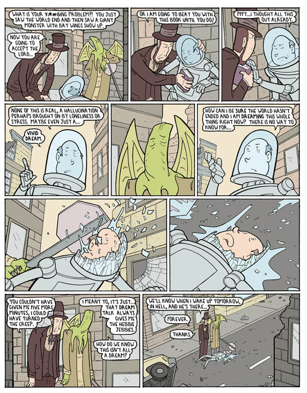
That ends up turning into something like this...
When I get an actual script from someone, to see if I want to
illustrate a project, Beyond they story being good (as there are
good stories out there that'd I'd be much happier reader than
havin to draw it) I'm basically looking for two things. 1- is it
going to be fun to draw 2- is it going to be a challenge. If it
doesn't have both of those things, I say "no thank you". Both of
those are different for me than maybe most people. For example,
something like this would be a "no thank you" -page
12- Splash page(that's were one image takes up the entire page)
"Hero punches villain into a parked car".
That is neither fun nor a challenge. Aside from maybe changing
the camera angle, if you had 12 different illustrators draw that
page, there'd be nary a difference between them to the general
public unless they each had some dramatically wild style. Even
then...the means of displaying that visual information is going
to be pretty much the same.
So, when Andy Brown gave me a script to look at for "From
Under The Floorboards" written
by Baden James Mellonie, I looked for fun and for challenge.
Plug alert! here's
were you can get all the info on how to get a copy
https://www.berserkerart.com/?page_id=15106
I read through it and said "yep"! I asked how much leeway I'd
have with the conversion from words to pictures. Most scripts
you get have visual commands like "viewed from above" or a
specific description of how to show the
visuals...which....really isn't how it's supposed to work. The
writer is the writer and the illustrator is the director. How to
move the readers eye around, get the reader to notice things,
get a certain reaction from the reader through visuals, and even
how many panels to use to convey an idea, that is an entirely
different skill set than writing is. If the person in charge of
the project has a different (wrong) policy, I politely say "no
thank you". Andy said "Do your thing, change the visuals or
panels however you like, as long as you get the point across".
Hell yeah, then. Let's do this.
So here's page one of the script...uhm...well, first thing I do
when turning a script into a comic book page is scribble on it
as I read. Sort of jotting down what's in my head visually as I
read/figure out how to convert it.
( You want a piece of advice, all you potential
artists/illustrators out there? SKETCH while you think. Don't
split it up into two things...as in imagining an image and then
trying to draw it. Sketch and imagine at the same time. Train
your imagination and hand to work simultaneously. )
Step one is deciding "what IS the point". What is the purpose of
this page on it's own and as part of the story. The point here
is to show what kind of guy he is/the environment he survives
in, and the tension of what he may or may not have heard.
Step two... finding any visual problems to solve. This script
has a common "problem" that drives me nuts. "the man
stops"...STOPS. When you're writing a story, it seems like the
most natural thing in the world for someone to "stop", but in
terms of conveying that with a series of static images...it's
nigh impossible, unless you have some overly cartoony scene
going on with speed lines and then a panel with no such lines
and a "screech" sound effect. Or maybe have the moving person or
object hits something and is stopped, and you can show an impact
causing the stop. But concepts like- stops suddenly- or - comes
to a halt- or any of that...maddenig to try to convey on a comic
book page.
It's like...how the hell do writers think we're supposed to pull
that off?! I am ranting about this...to myself, because I have a
"car comes to a slow stop" in MY OWN current story. I.E. I do
the same thing to MYSELF...all the time...even though I know it
can't be done.
Okay, problem two, the concept of- he thinks he heard something.
How the...sigh... You can either have a sound effect or not have
a sound effect. How in the blue hell do you convey the idea that
he thinks he heard something?!
Believe it or not...these two "problems" made me even more
interested in illustrating the script. It's a good story, if the
illustrator can solve these "problems" it'll stay a good
story...Baden did his job, someone else now has to do thiers.
I'm either one of the best, or I am not...so let's figure out a
way.
Problem three- is more of a "know yourself" type situation. I
have a specific style and skill set. a lot of the visual
information James gives...I'm simply not good enough to do much
with that. Bernie Wrightson or John Buscema could do a hell of a
job showing a face that was weather beaten and rugged and so
forth. You'd almost be able to feel the leathery skin and
wrinkles.
Me, with my skillset, I could either make him look somewhat
grizzled or try too hard and have him look like a crazy old
wizard. The more I'd lean into the weathered look on a face, the
more comical or pathetic or sinister he'd look, instead of
rugged and tough. So...in a "first do no harm" mindset what I am
unable to do in that regard I am going to make up for in getting
that point across with the visual story itself.
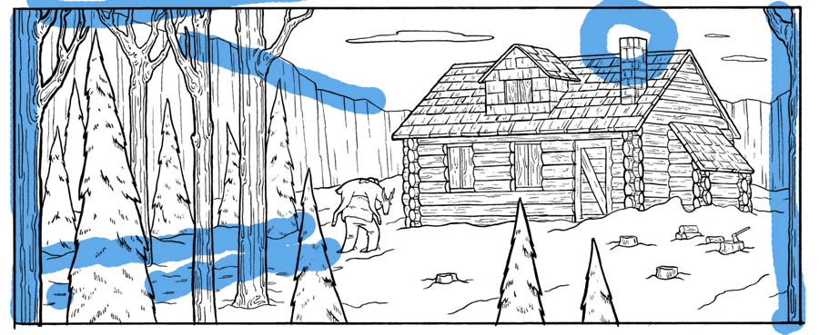
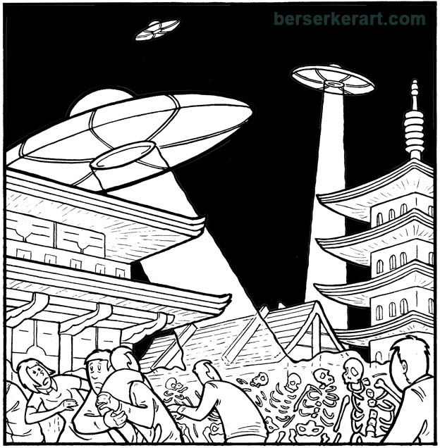
Right off, knowing that we want tension...I'm taking the visuals
of the cabin he is walking towards and putting them last instead
of first, as well as not having any smoke coming out of the
chimney. For the sake of tension, we want him alone, isolated. A
cabin in walking distance in the initial shot makes him less
isolated and smoke coming out of the chimney might imply someone
else is already there. Aside from the tension, showing him alone
in the woods makes him seem more rugged and formidable.
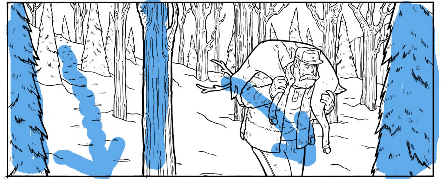
Visually, I set the panel up in sort of a "golden ratio" with
two large trees in the left foreground sort of creating a panel
of their own, and the big pine tree on the right keeping the eye
from trailing off the page. The tracks in the snow are headed
down to the next tier of panels as does his body movement (his
body movement and posture will have a relationship with the
panel directly below...I'll get to that later)
The next tier is the "he thinks he hears something" dilemma" .
Which I think I worked out pretty well...
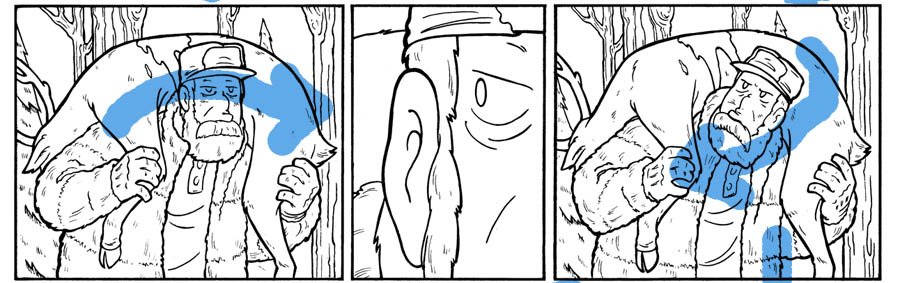
First panel, a rather standard camera shot. His face is calm and
fairly expressionless. It is over the top ordinary, in order to
add as much impact as possible to the transition to the next
panel ( visual side note- The implied line of the deer and his
posture lead the eye into the middle panel).
panel 2- Jarring (hopefully) close up of his face looking to the
side, with the ear being the center focus of the composition,
which theoretically will plant in the readers mind that he hears
something. The next panel has him looking over his shoulder
(visually he is leading the readers eye back to that middle
panel).
The tier below this one benefits from all of that...
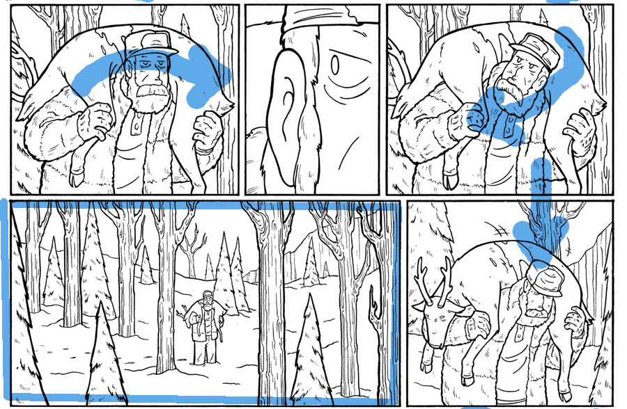
A long distance shot, far wider panel than the one previous
conveys a bit more time is elapsing. And instead of several
panels of him looking to see what is around him, we accomplish
the same effect by being able to see what is around him and that
he himself is taking it all in. That last panel on the right,
very similar posture to the panel directly above which helps
convey the movement of him resetting the deer carcass to
continue his journey.
Only after that tension has passed do we see him coming up
towards the cabin...
Not much trickery needed in this last panel...some implied lines
visually lead the readers eye/adding to the momentum of his
march towards the cabin. The script also called for a shed, but
it's not needed for any later outcome and there's only so much
you can competently fit into a panel without it being a visual
mess. I decided that the edge of the woods he was walking out of
added more to the scene than a shed next to the cabin.
But...that's just my own choice. For sheer pragmatic story
telling purposes, it could have gone either way, but as far as
giving the page as a whole a visual unity, the woods worked
better...so that's the choice I made.
below is the full page and it's got a unique compositional
effect, that I like to try to pull off on pages with not much
action going on. That being, that you could read it top to
bottom, from either side and still get the same general idea. Go
to the far right or far left and read straight down, and it
still makes sense/ gives you a story.
Just a little technique I try to work in when possible because
it give the page as a whole a lot of unity.
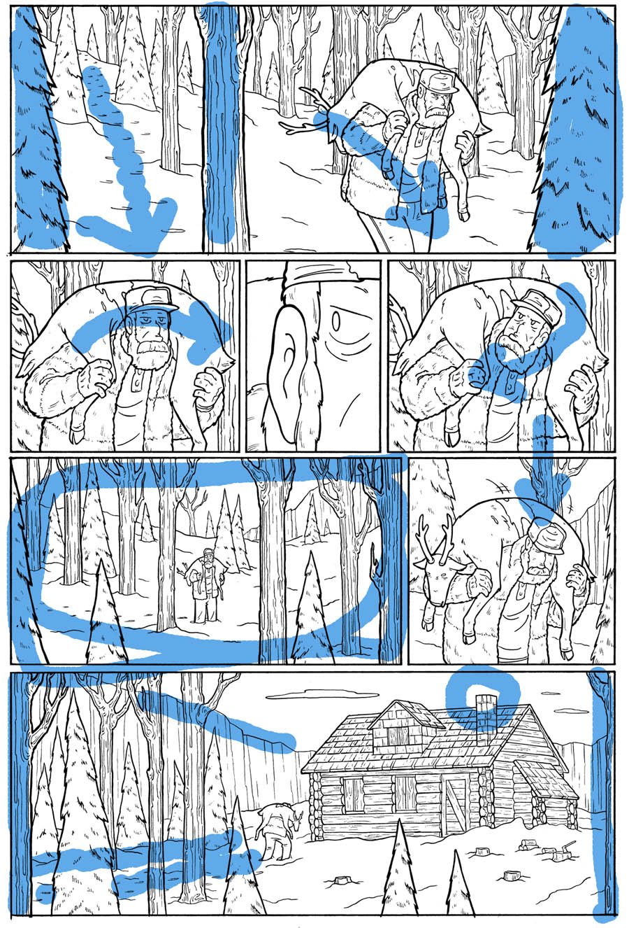
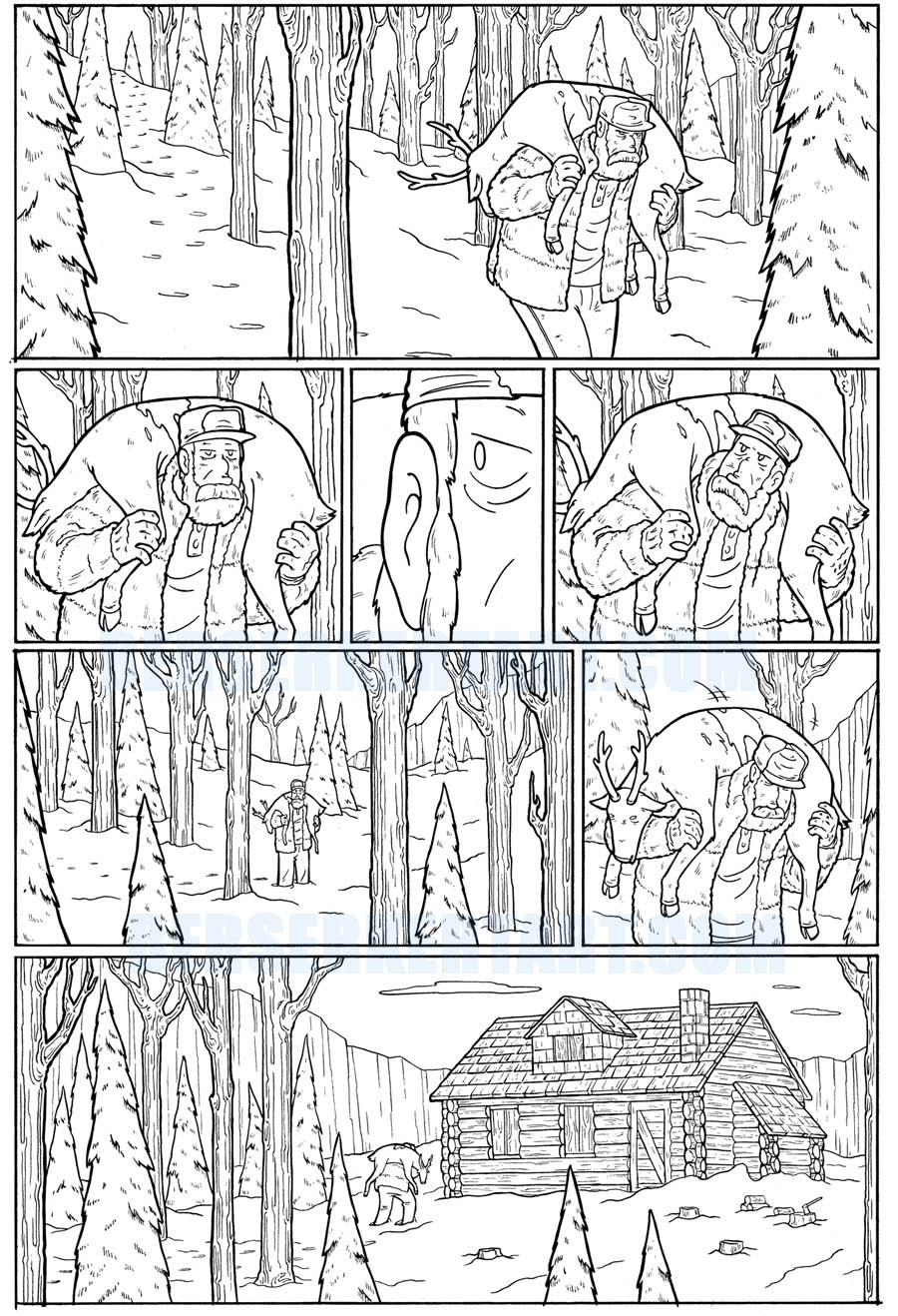
Here it is without the blue scribbles...
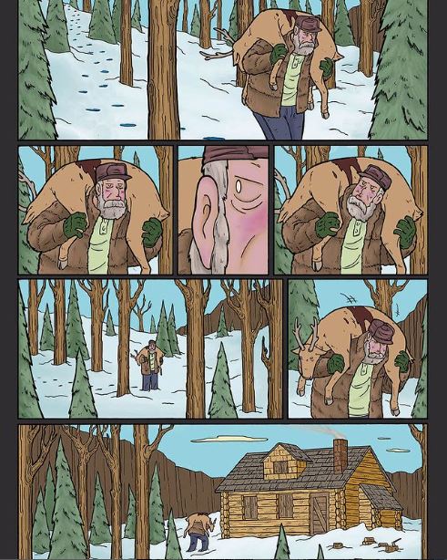
Oh! and here it is in color, via the work of Andy Brown.
A fun challenge...but make no mistake, plenty of action in this
story as well. To that end, soon I'll go over a bit of how I
illustrated some of the action scenes...
Til then, you're local comic shop can get the book this story is
in (along with some other great work by some great storytellers)
This link'll help if they have questions
https://www.previewsworld.com/Catalog/OCT231562?fbclid=IwAR2W64BZwO3pVUbc2wGvxTp1ktyzwDp0UEwO3HKyfkUP8rmmqRFRZvM2zdw
Later