
This week's Blog
The crappy ink pen that changed how the world looked
also
1920'S hygiene
Lots to cover today. You are going to learn A LOT. Including
about a drafting tool that changed how everything looked for two
decades, hygiene in the 1920's...we're gonna run the gambit here
because I missed a few weeks.
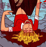
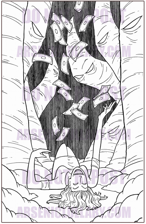
First off, I made progress on the cover I showed ya last time...
Protect your art from AI with Glaze
or
Nightshade
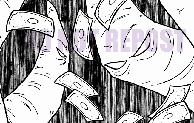
I conferred with my buddy Jared, and decided to just get rid of
the buildings in the background, as they were a symptom of my
own artistic vanity, and only complicating things visually. I
instead went with the ole uneven linework to fill it in.
Protect your art from AI with Glaze
or
Nightshade
How you make that is...unfortunately, just how you'd think. Make
68thousand lines. But if Basil Wolverton could do it, in an age
before energy drinks...
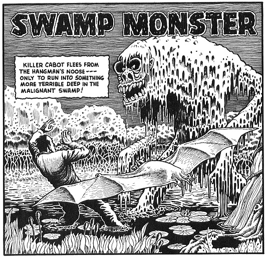
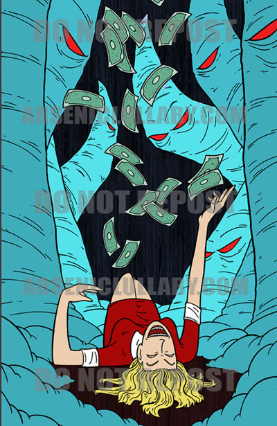
... then so can I. The real issue, in my head this whole time,
has been colors. This is were it stood with my own instincts at
the wheel.
Protect your art from AI with Glaze
or
Nightshade
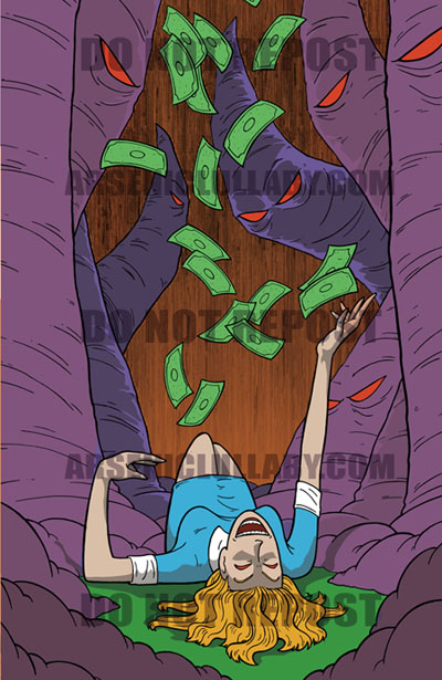
I like it, but I'm entirely not sold on those colors. I asked
Jared, who's coloring is way different than mine to give it
try and see how he'd approach it. (btw Jared is up for an award
and you can vote for him
HERE).
Protect your art from AI with Glaze
or
Nightshade
I'm not really a fan of having shadows on my work, but it's
tough to argue that this ain't scarier. I don't personally
like the colors, BUT I do think it's better, and one can't limit
his palette based on personal like...or I'd never use the color
green or orange. A larger problem is her in blue gives it a
Alice in Wonderland look and THAT we do not want. Also the
purple kinda leans into Anime tentacle vibes...which we also do
not want. Though, initial thoughts of it being some anime
tentacle monster or H.P. Lovecraft cosmic horror might be
unavoidable.
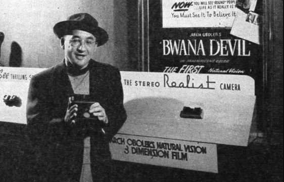
All you H.P. Lovecraft fans out there, know this- his ambiguous
writing style wasn't some out of the blue, mad genius sh*t. It
was a whole style/genera, then. The reason you know who he is
and not everyone else, is that he let his copyright lapse and
Cthulhu became public domain. He was a hack compared to
Arche Obelor.
You want some ambiguous horror writing, that'll put hair on your
chest, go search YouTube for his old "Lights Out" radio
dramas. Now that I've bored everyone
who doesn't know who either of those people are...
More or less that'll be the cover of the upcoming
issue, which I will have more info for you about next time.
Important info...like who's gonna publish it and why.
C2E2 in Chicago went well, sold a lot of books, got a few cool
commissions. A more involved one, that required doing after
the show, was for Daredevil vs some of the Arsenic Lullaby Zombie
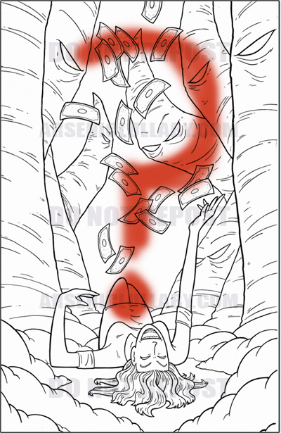
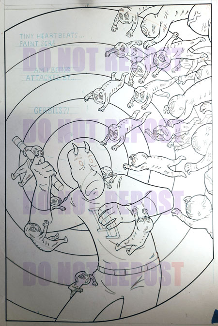
Fetuses. This was to be a full fancy pro inked 11x17
illustration. I played around with the idea roughly
and we decided on this-ish.
(Assuming you can make anything out of this scribble...)
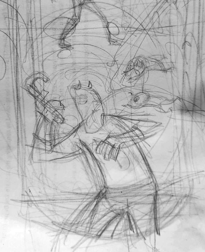
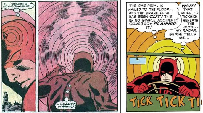
With some word balloons to add a gag and of course DD's standard
radar sense circles.
So...the more refined final sketch was like
so (below). Though I laterdiddmuch hand wringing about how many
fetuses and in what arrangement.much hand wringing about how many
fetuses and in what arrangement.
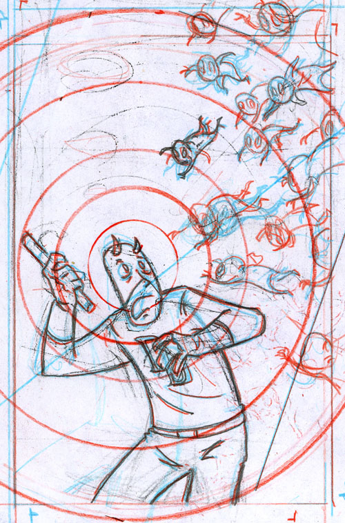
That, up there, seemed like a pretty good amount, but when I blew
it up to 11x17...it felt a bit sparse. It's a delicate balance,
how many cartoon fetuses is too many and how many is not enough.
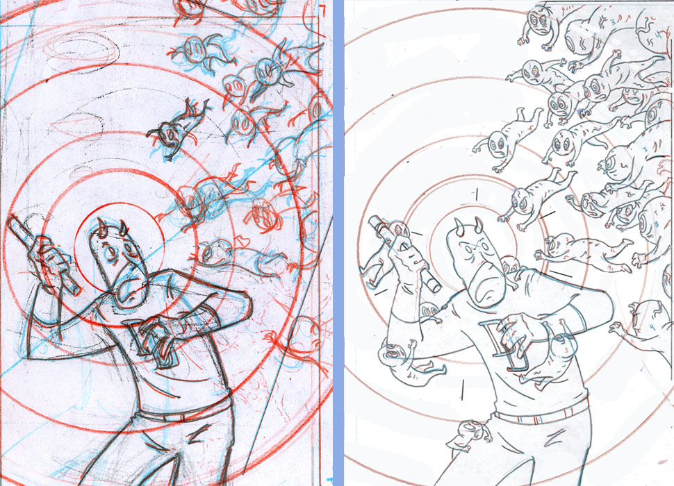
It's almost two different stories...depending on how many
fetuses. One, him already
covered by some, and one with only those coming at h. Like, one is a split second of
time and the other is the middle of an ongoing struggle. This is
going to have thought balloons, so the struggle scene jives
better.is a split second of
time and the other is the middle of an ongoing struggle. This is
going to have thought balloons, so the struggle scene jives
better.
The real challenge here is going to be the customary circles to
imply DD's radar sense. At 11x17 that's trickier than you'd
think.
...for the inner three
I can just use a standard compass. You all know what one of
those is, right?
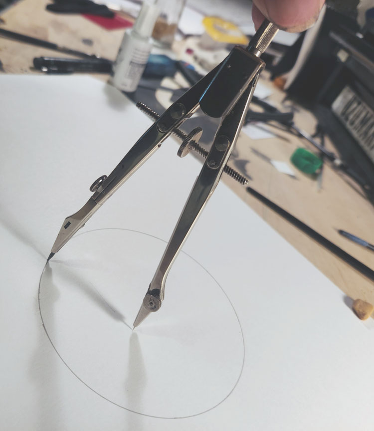
There's an adapter for the fancy one like I got, so you can use
a technical pen with it to ink the circle. You just take the
pencil lead thing off, shove the
adapter in, take the technical pen apart, screw the guts of the pen into
the adapter, and there you are.
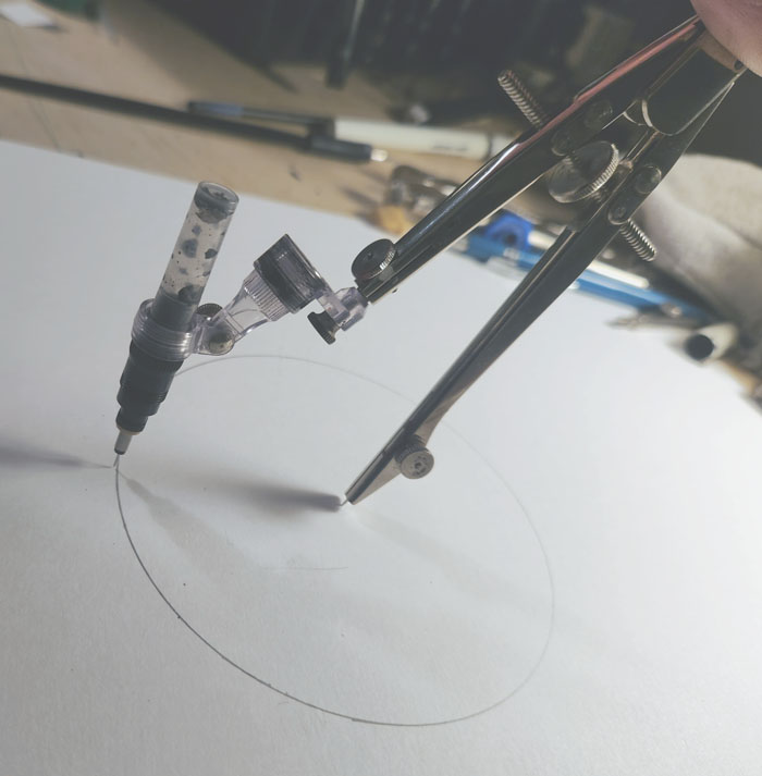
BUT, this thing ain't big enough to draw circles a foot and a
half in diameter, like I need for the outer circles on this
drawing. You need a beam compass for that.
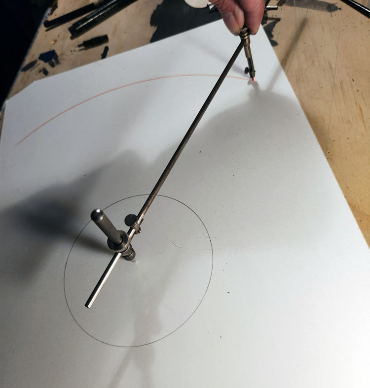
I have one. It was my Grandfather's, who was a draftsman for an
engine company. When He passed away I ended up with a lot of his
drafting tools. This set here has all the parts for a beam
compass...
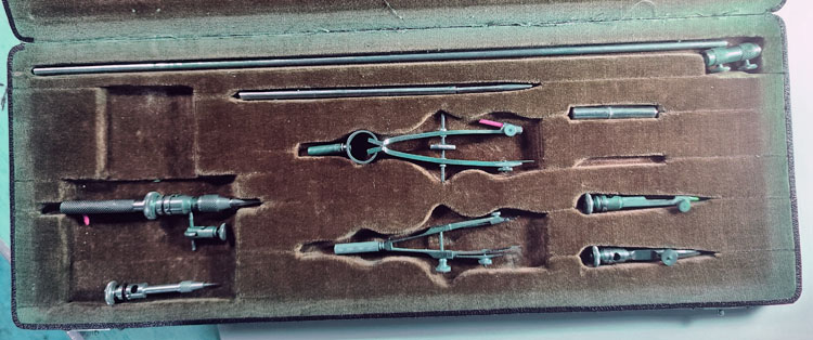
but it's from the 50's or earlier and predates technical
pens. So..no way to ink with it with the adapter/pen tip. What it has
for inking, is...this
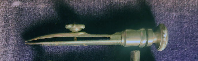
THAT is the head of a line pen
that fits onto the beam compass. I'll explain what a line pen is
and we'll all understand why Grandpa didn't want to talk to ANYONE
for several hours after he
got home from work. Here's a line pen...(sometimes called a
ruling pen)
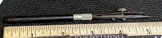
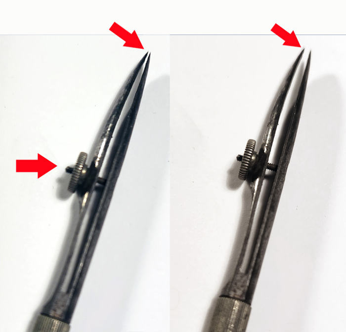
That little dial in the middle adjusts how far apart the tips
are, and that determines how thick of a line it will make...
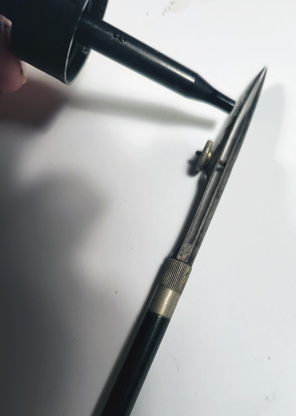
First you gotta fill it with ink. and you do THAT with an
eyedropper. You squirt a few drops in between the two tips and
the laws of physics keep the ink in (in theory, but not really)
and gravity pulls the ink out as you drag it along the paper.
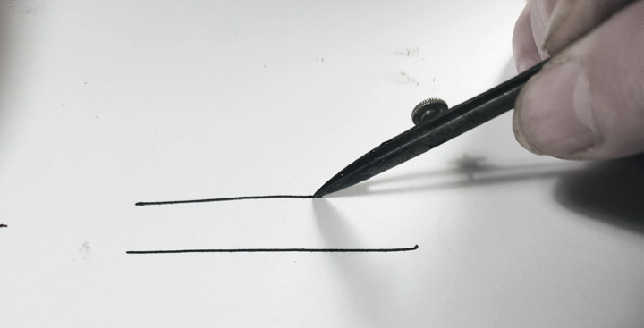
The upside is, these things make the sharpest, crispest lines you
ever saw and the precision/variation of line width you can get
is amazing.
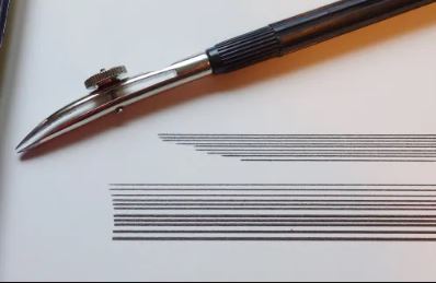
These things love making straight
lines. You got two points of contact to the paper, they both
sort of dig into it a little...you can make a straight line a
foot long without a ruler as long as you're half trying. You
just put it to the paper and pull down and it pretty
much keeps itself straight
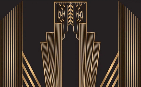
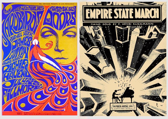
All that cool art deco art and ads and design from the 20s-30s, where it was lots of tall lines of varying thickness,
repeated, stacked, borders with more boarders...that was all
done with line pens.
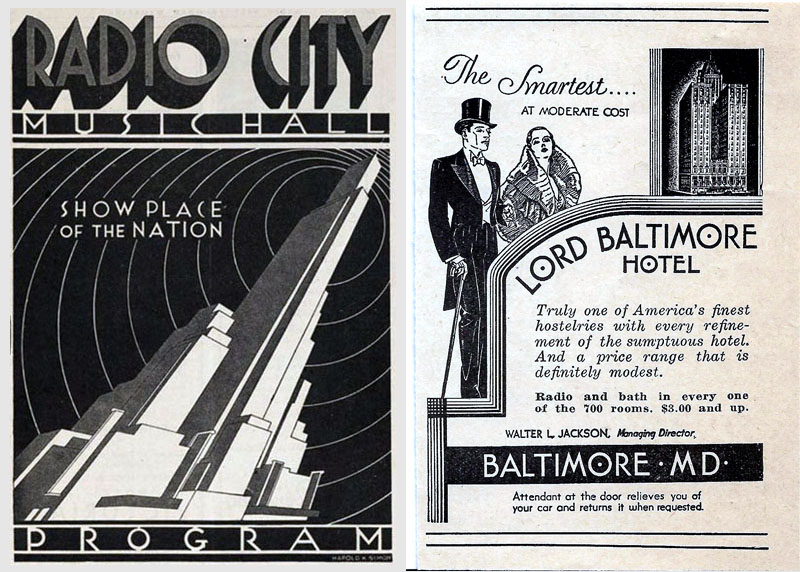
What you make is always
a by product of the tool you're using, to one degree or another,
and the tool of the day was a line pen. Letters were often tall
and/or narrow...The fonts you think
of/see for art deco, or the 20s and 30s in general, were that way
because that was the easiest way to letter something with a line
pen.
All design, at least back then, started on the drawing table.
How things looked, from ads to toasters, to cars, to buildings,
all started on a blank sheet of paper...with the tools of the
time (e.i. a line pen).
The tendency to use this pen for what it does best (narrow repeated
lines, close together) translated to everything they designed.
In a way, the entire look of the world, for a time, was the by
product of that pen...skinny letters, stacked lines, extra
boarders.
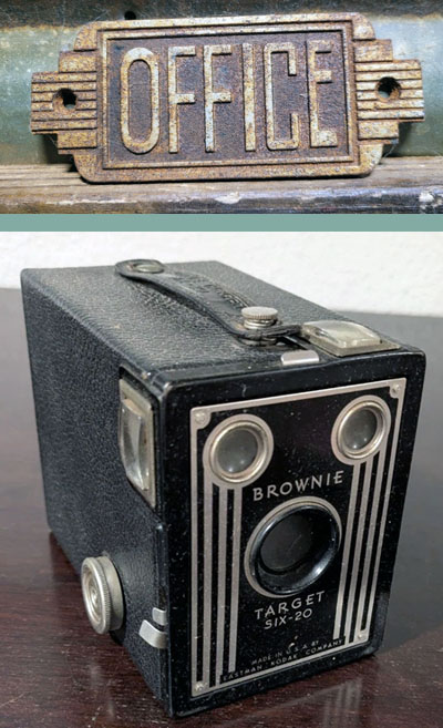
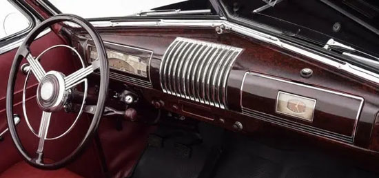
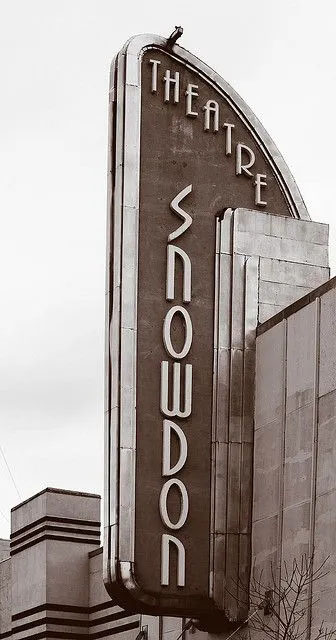
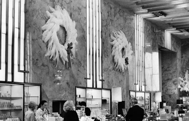
People romanticize "art deco" as some zeitgeist, cultural
mood...when really, it was because of that pen. Much like the
balloon-ey lettering and rounded edges on everything during the
hippy days, was less a change in mindset of designers as it was
because technical pens were on everyone's drawing table
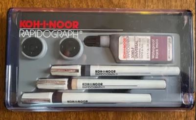
once these were perfected (ish) and readily available, you could
actually make a curved line freehand without smearing ink
everywhere ( more on that in the second). Technical pens had
been around for awhile before they were actually worth using.
The earliest models came out in the late 30's and they were
terrible. It wasn't until the 60s that technical pens got more
refined and finally overtook the line pen as the tool of choice.
And that's when you started seeing lettering like this...
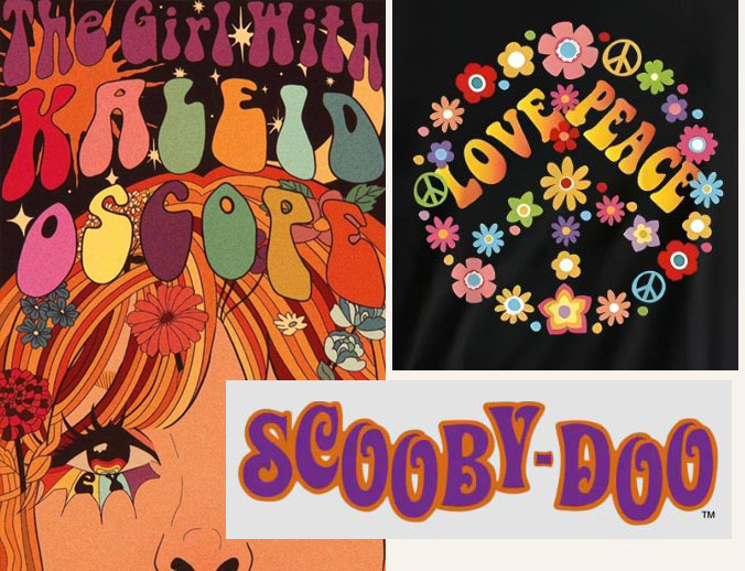
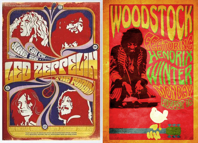
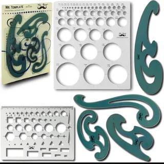
You can not do stuff with a line pen. The dual tips touching the
paper, which makes it so great at straight lines, also makes
them nigh impossible to make curves with, unless your using some
kind of template or stencil or curved straightedge (French curve
set). And the odds you are going to smear ink using a line pen
and a stencil are really really high.
Was the wild expressive imagery being made first in the 60s and
70s a reflection/bi-product of the cultural change going on?
Meh... maybe. BUT, there's also the factor that graphic
designers finally had a tool where you could make big curves and
loops with a consistent line, without templates, or stencils.
And those people, unchained from the time consuming precision
needed for line pens and brushes, could knock out their projects
in half the time if they just crapped out big hippy lettering
with a technical pen.
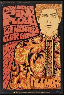
Is stuff like this visually impressive and expressive...sure.
But to someone with skill and a technical pen it's - "I can
knock this job out before lunch, if I go all out on the weird
lettering".
A tool not only determines what something will look like,
but your whole mindset, as far as what you are going to try to
do in the first place...based on what they can do. The boss says
"spice up this ad"... 1970's guy with a technical pen
that's good for drawing curves, makes everything curvy. 1920's
guy with a pen that makes straight lines, adds dynamic straight
lines.
Which makes me wonder if I shouldn't maybe take a try at hand
painting this cover a couple of ways, maybe with watercolors or
acrylic paint, just for the sake of figuring out the color
palette I want. Using photoshop might have me thinking inside
the box too much.
Protect your art from AI with Glaze
or
Nightshade
Back to line pens....
The downsides to line pens, aside from being garbage for
drawing curves, is they are a
pain to fill, and you have to refill them constantly. Also they drop ink all the
time on the way to the paper or across the paper on the way to
what you were going to ink, and it's a 50/50 chance that its
going to come out in a big glob the second it touches the
paper...
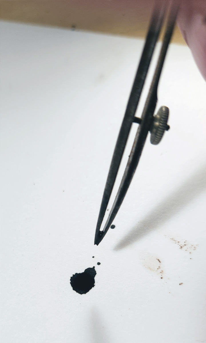
It also likes to come out in a big glob when you end the
line and take if off the paper if you accidentally tilt it. and
they lay such a thick line of ink that it's five minutes before
it is dry enough to touch. Which means, if you are not super
careful ( which I am not) you're going to smudge lines often.
Prossibly...if I used one everyday for three decades like he
did, those things would not happen. Either way, they ain't
exactly user friendly.
While I was looking for art deco ads as examples, I ran across
this from the 20s
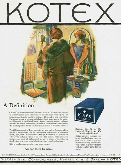
A tampon ad...in the 1920s?! What the hell they made out of?
Asbestos and cocaine probably. And there were several competing
brands.
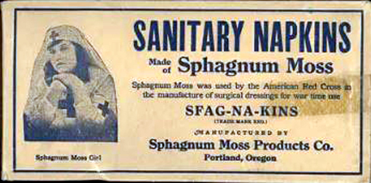
..."sphagnum moss", I guess that answers my "what were they made
out of" question. Frankly, asbestos sounds nicer than sticking
moss on your...
In case the text is too blurry to read there, it
mentions that moss was used by the red cross during the war.
So...that's a military grade tampon, right there.
This tampax one is pretty stoic.
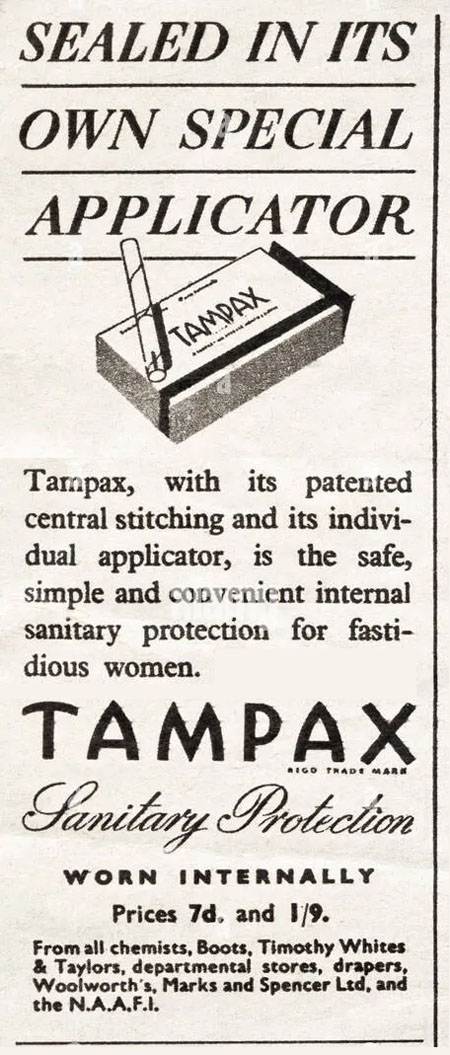
They mention it's used
"internally", twice...I guess idiot proof
warnings aint new. I like the
strategic illustration that makes it look like its the size of a
cigarette. I bet the reality was a jarring surprise when they
opened the box.
That's the fun thing about research, you end up learning things
you didn't even figure on learning. Women had periods as far
back as the 1920s...crazy.
...how far back does this "period" thing go anyways? Back to the
cowboy days? How far back would I have to go before a woman I'm
with isn't tired of my bullsh*t, one week out of every month? Now
that I think about it, according to Deadwood, they had
periods at least as far back as 1870, and the doctors used to
prescribe opium for it. That's turning a negative into a
positive. We should still do that. A prescription for opium
ain't a bad idea no matter what day it is, if you're having to
deal with me regularly, if I'm being honest.
Did George Washington's wife have periods? "Dear Martha, the
cold here in Valley Forge is rather dastardly, and I'd like to
come home. I feel you took my comments other than as they were
intended."
It wasn't mentioned in the Odyssey...or in any
Shakespeare plays...so...sometime between 1611 and 1870 is when
periods started. I looked for stuff that changed in the 17th
century and found...THIS

Ah ha! caffeine is what caused periods. Next time I'm around a
woman who's on her period and getting frustrated with me I'll
let her know. I'll just say "if you didn't drink so much
coffee, your vagina wouldn't hurt". Let's all try that.
Anyways...trying to make a circle with this wonky pen tip,
attached to that awkward to use beam compass, was going to be
fraught with peril. Also, It dawned on me that compass is going
to leave a noticeable/distracting hole in the center of DD's
head, after making 6 circles with it.
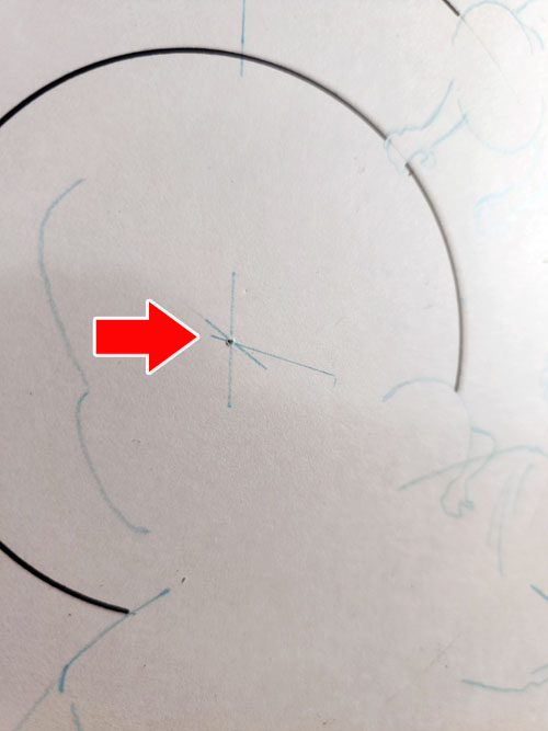
One could say "that's part of the process", but...I'm going to
try to avoid that. Some things are more acceptable to me as
"part of the process" than others. White-out for example. People
ain't perfect it's being done by hand...you're gonna have to
white out some things here and there.
In this case...the word balloons are to be right over some of
the circle lines.
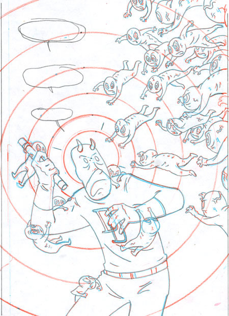
And every time I put this tip to the paper and bring it off, I'm
spinning the revolver cylinder on a game of Russian roulette.
It's hard to explain how unwieldy this thing is.

Most of the problem is out of my hands as far as how steady it
stays. It has the part making the line, the part that pokes into
the paper and a rod next to it as a brace. And each of those has
a little dial to tighten them.
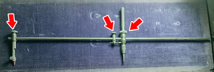
And those dials are 50years old and that rod is polished
stainless steel. They just do not want to stay tight. I could
get a pliers and try to crank the sh*t out of them, but it's
even money they'd snap right off. So...the tool has some
limitations. The ink tip likes to
pull inward coming off the paper and/or leave a blob. Some of
that is me, but I made several test runs and a lot of it is
because this thing's not tightening up.
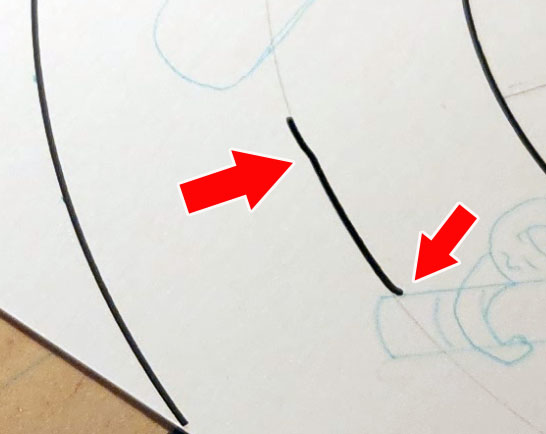
I know I can white out the part of the circle I make with it,
where the word balloons will be, and have it be next to
unnoticeable. I do NOT know that I can make large circles
picking up and putting the tip back down on the paper avoiding
the area with the word balloons. (read between the lines on that
as- I don't think I can. I tried several times, each
ended in tragedy.)
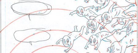
I think I can do it in the areas where the fetuses are
clustered, because if there's a small issue when I drop or pick
up the tip I can mask it by thickening the fetus outlines, and
there is a lot going on visually. The word balloons though, they
are all by themselves, there ain't anything going on around them...any hickup in the
circle line will stick out like a sore thumb.
Grandpa could maybe do it, but he worked with this thing for three
decades. I don't think my guy wants to wait that long for
his commission.
But, back to the hole this makes in the paper. That's what this
thing is for...
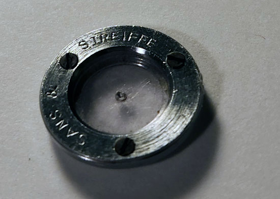
the amount of paraphernalia in ole Grandpa's tool kit just to do
different specific things is
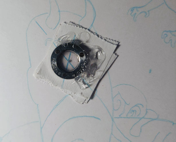
amazing. This little circle has a hard plastic tab in it, and
you poke your compass point onto that so it don't poke into the
paper.
But, "how well does it stay put on the paper?" you may ask...very poorley. So, what I did was hot glue the f*cker to some real
thick removable tape and that worked okay-ish.
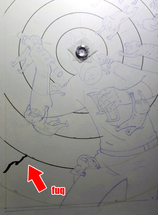
I took a smart pill and just did the rough outlines of the
drawing, knowing I'd f8ck up a few attempts and not have to redo
detailed final pencils every time. and I did, f*ck it up a
few times. this last one really hurt because it turned out great
and I just titled the pen too much on the way off the page,
scuffed it and glorp...ink trail.
Y'know, after seeing the competing tampon adds...I got a thought
about the whole Epst8in Island
thing. We can all agree it is horrific, so we're
going to put that aside for a moment and be stoically business minded,
This was a
lucrative business with a clientele that many criminal business
men would be interested in having as customers. Which
means...this wasn't the only such island and he wasn't the only
person offering this.
ANY business or product that makes
money has competition. There's Tampax and there is Kotex, there is McDonalds and there is burger
king. There is BMW and there is Mercedes. You see what I'm
getting at here? Everything that guy had going on, someone else
also had going. And so, is still going on
somewhere else, run by someoneelse.else.
It's not like this guy invented a death ray, or had some intricate
Oceans 11 plan, that no one but him could have come up with or
pulled off. It was an underage honey pot for rich people. That's
not really reinventing the wheel. And I don't know if you read
any of the emails, but this guy wasn't exactly D.B.Cooper. He
seemed like kind of a dope. So...there's no way he was the only
one doing this.
There's always competition. There is coke and there is Pepsi,
and actually...there is also RC cola and the generic knock off brands
like Kroger Cola. So...somewhere out there, there is the Kroger
cola version of that island. Which is a premise I'm probably
better off not exploring here.
...
Like...maybe they aren't even underage. The guy's just trying to
pass off short eastern block refugees in ponytails as grade school-ers. "hey, what are you trying to pull here? This
"twelve year old" has a Def Leopard tattoo, and made a reference
to the Andy Griffith show".
I have worse avenues to go down with that basic premise than that, but let's just move on.
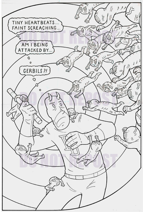
Here's how it turned out.
Protect your art from AI with Glaze
or
Nightshade
Later
 |
ARSENIC LULLABY ONLINE STORE
TEMPORARILY OPEN
10.00 off second print with coupon code- 2prints2 |
 |
SUBSCRIBE TO THE A.L. Email updates
Get a weekly(ish) email from the
writer/illustrator of Arsenic Lullaby.
Some
week's it's a sneak preview, or a long rant, or
news about new projects before we tell anyone
else.
HERE |
|