This is arguably my most detailed
and best work as an illustrator using traditional mediums and
yet it really requires the modern ability to NFT in order to
been seen properly
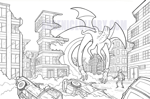
My philosophy on minting an NFT is,
by an large, to mint pieces that could only exist specifically
as an NFT. Whether it's because of sound, movement, colors or
effects that would not transfer to print with as much impact, or
perhaps details that would be lost via physical print.
So minting
a black and white illustration may SEEM to be at odds with that,
but it is NOT.
This was
originally, painstakingly drawn then inked by hand with a no.0
brush, if you've never used or even seen one...they come to a
point as fine as a needle.
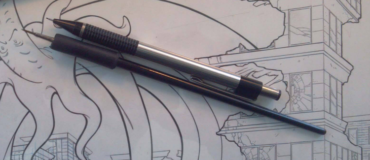
I ink with this because...I hate myself? I love a challenge? It
is the only way to give it that old school look?...probably all
those reasons. The fact of the matter is that as far a
traditional inking, so many of these line could only be done
with a brush, that it's pretty much not even worth it to go back
and forth between instruments. The long curves...you need a
brush for that or the line will be sterile and charmless. The
broken window need lines soooo think and crisp that they don't
make a pen that can do it. Things that are dented, shipped,
broken wavy...all look better with a brush
Keeping in mind that this
original illustration needed to be reduced by about 75% to be
comic book size, means that there are lines you see here that in
print are muddy, less crisp, rasterized...if they even showed up
at all. Add color to that and it's even more diminished in
physical format. There is no functioning industrial printing
press that could capture all these lines and all the detail.
Add to
that, it was used as a Comic-Con International Exclusive and as
the cover to the limited hardcover variant, so portions of it,
got covered by logos, UPC codes, ect...and a black space was
left so that fans could get a sketch on the back. Hell, the
hardcover version was one sides and didn't even use the right
hand side of this.
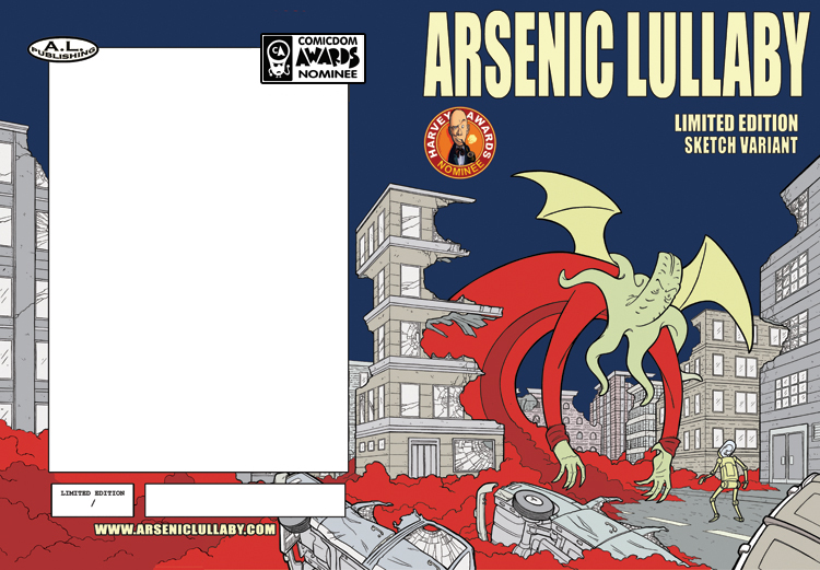
It is a
HEARTBREAKING, when you look over a work that you spend 40 plus
hours on, and much of it is not there for anyone to see.
If you're new to my work, you'll
understand that I'm being conservative when I say 40 plus hours.
Here's a bunch of progress pics.
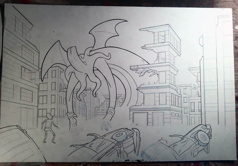
First the
initial sketch...
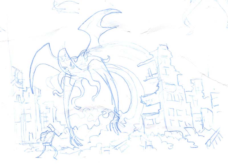
That will
work, I said to myself. I can widen the shot to the right to
include as much destruction as I need for it to belong enough to
wrap around and fill the front and back cover. I'll want to
actually draw this flipped so the monster is facing the other
way of course, otherwise he'd be on the back. But...this will
work.
Off I go, refining the sketch...
Then you tune it up, refine it,
add in the vanishing points, so that everything is in proper
perspective (2 point perspective in this case)...
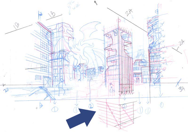
This is
where I figure out the horizon line and vanishing points so
everything is in perspective while retaining the impact of the
composition. That blue arrow points to a guide below that
building that helps me figure out how much narrower each window
needs to be that the one next to it in order to stay in
perspective ...I added that arrow because I was going to explain
that, but upon further consideration, it's complicated and
boring. Also, you could do the same thing on a computer. I don't
because I've done it so many times that using a computer doesn't
really save me anytime, but If you haven't been doing it the old
fashioned way for ten years, I can't say it's worth learning.
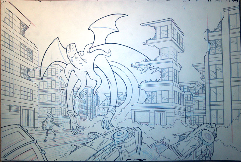
ANYWAYS...onto the final penciled work
The point is you get here...
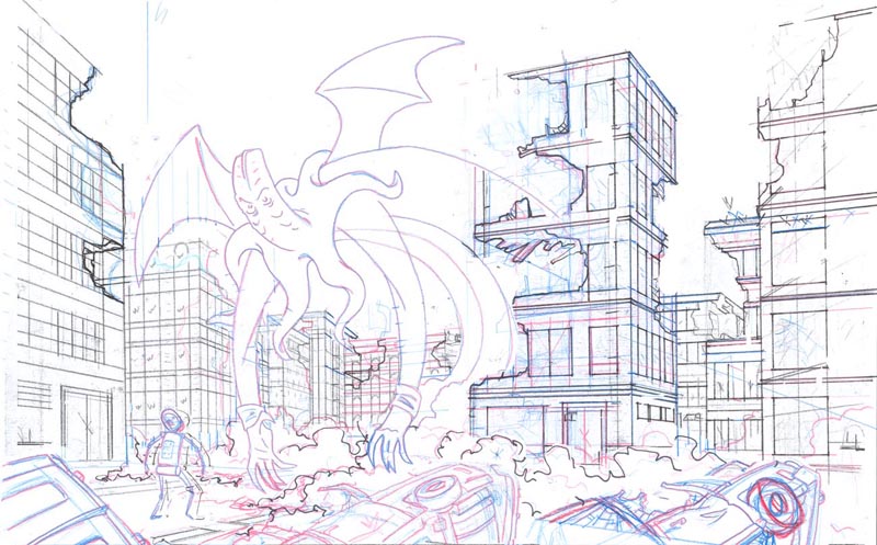
Then do
the whole thing full sized...( 13 inches by...something, I
forgot what)
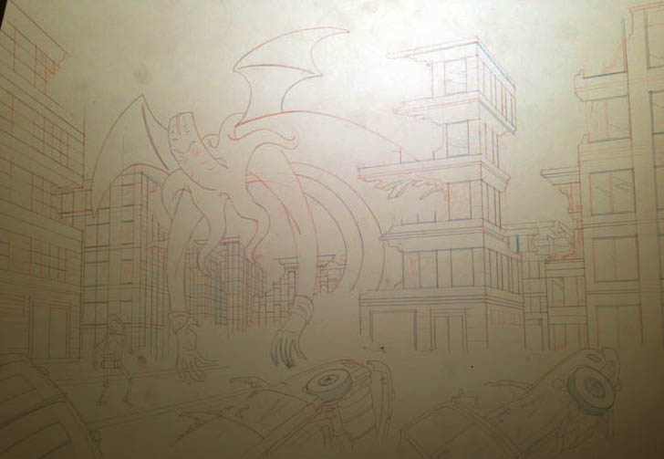
Holy crap
my camera sucks. It' could be user error, though. This is 11x17.
This stage here I pencil every detail and refine it as much as
possible so when I start inking..all I have to worry about it
putting the ink down. That's hard enough, I don't want to have
to make any creative decisions at that point. So....inking...
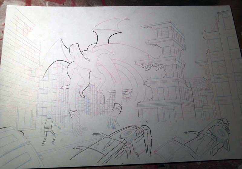
It is never a good idea to ink when
you are in a hurry, especially with a piece like this. Some days
straight lines are easier and curved lines give you trouble,
some days it's visa versa. Depending on how much coffee you
needed to get going, some days trying to ink the tiny details is
not a fantastic idea.
at this
point I realized I drew the damn thing backwards. I wanted to
the figures facing the opposite way. Computers do come in handy!
I never sad they didn't...I just had to flip the image once it
was done and I scanned it in.
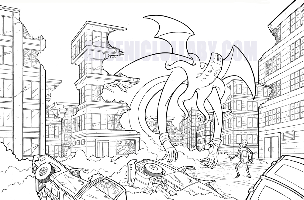
That's a lot of fine work...and it
was a damn shame that in print it looked like the image above
for the soft cover, and more of a shame it looked like this on
the hardcover...
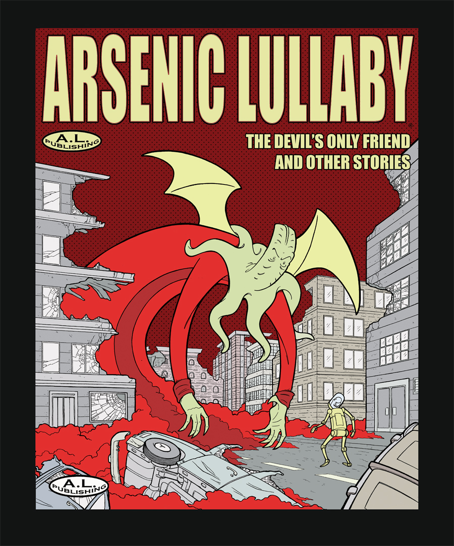
Those are
very good covers, I'm proud of them and would put them up just
about any other cover on the shelf...but still...heartbreaking.
BUT...as an NFT, every line can be seen, taken in, be as crisp
and clear as possible.
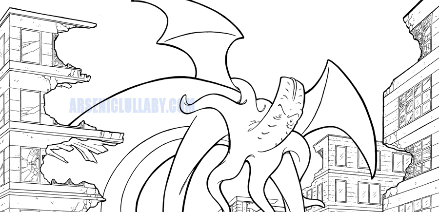
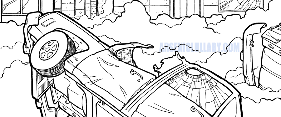
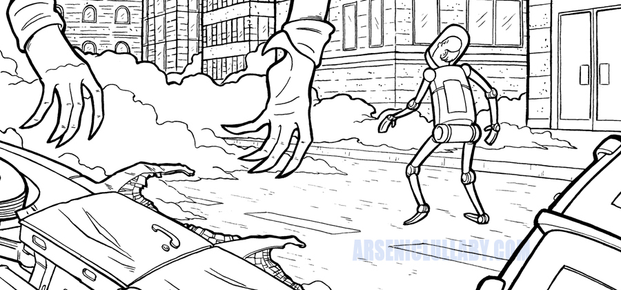
This is,
so far, arguably my greatest illustrative work. and until the
advent of NFT's is was resigned to accepting that much of the
detail and impact would be forever lost.
But it's
here now. Every line every shard of glass, every dent, every
wisp of smoke, to live on in the blockchain. I am profoundly
proud of this piece. and extremely happy that, as an NFT, the
work is finally all there to been seen.

FULL NFT ON DISPLAY HERE
Aside from all
the fun and innovation you can do in the NFT medium, it is also
defiantly a medium that outshines print even when you are
dealing with something as traditional as a inked drawing.
It'll be at this link on
...and there will only be ONE available
https://makersplace.com/arseniclullaby/